Modifying the UI in WebViewer 10.6
By Roger Dunham | 2024 Jan 18
9 min
Tags
webviewer
ui customization
javascript
Summary: The WebViewer simplifies UI customization with its versatile features, empowering developers to craft adaptable, user-centric applications. This flexibility provides a personalized and efficient experience that caters to your preferences and specific needs.
Introduction
The Apryse WebViewer is a powerful tool for viewing, editing, annotating, and working with PDFs and other documents. It is functional straight out of the box, and the UI is both responsive and also extremely configurable. You can test this for yourself using the WebViewer Showcase for toolbar customization.
At its simplest, you can choose the language used in menus and messages – there’s a wide range available, including all major European languages, Korean, Bahasa Indonesian, Chinese, Thai, Japanese, and more. Depending on your preference, you can also choose either light or dark mode. Configuration options, however, extend much further, with the ability to choose which Tool Groups (menus that contain tools with similar functionality) should be visible, and even which tools should be within a specific group. You can take customization even further with the ability to change the icons and titles for each tool, and even add entirely new panels.
There are dozens of options available within WebViewer that can be enabled or disabled. While the default options give a great result to most users, if you need something different it’s easy to do.
In this article, we will look at how to modify the UI and work though examples of how to make specific changes.
Experience the future of document viewing with WebViewer’s Modular UI.
Using Showcase to Try Things
The easiest way to try things out is via the Showcase.
Before doing anything else, note how the menus respond when the browser size changes, so that it looks great regardless of the device it's viewed on.
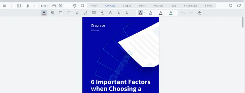
Figure 1 – The UI for the Showcase, using just default options on a large screen
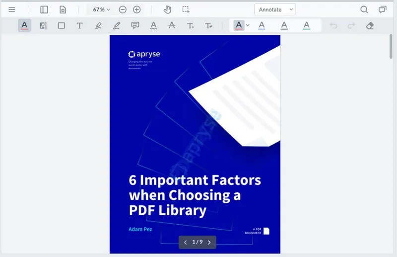
Figure 2 – The same document when viewed on a narrower screen. Note how the top menus have automatically been combined into a dropdown.
The showcase also allows you to change the display language via a simple interface, and even remove buttons from tool groups.
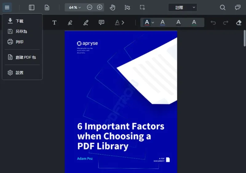
Figure 3 – The same PDF shown with the WebViewer configured to use Chinese text in dark mode, and with some of the tools removed
The showcase is a great way to get started and it even generates a code snippet that can be copied into your own code. Go and try it out!
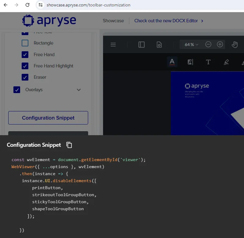
Figure 4 – Example of a code snippet generated by the Showcase
Making Changes at Design Time
While changes can be made to the UI once the application is running, as we have seen in the Showcase, it is also possible to define the UI within the code that is used for the application. The code snippets created by the Showcase can be a great way to start, but much more customization is available than is shown there.
Let’s look in detail at how to implement UI options. The article is based on the code from the getting started with React documentation which instantiates the WebViewer then assigns it to a DOM element via the useRef reference “viewer.”
The WebViewer constructor returns a promise, and the instance can be used to customize the UI.
useEffect(() => {

WebViewer(

{

path: '/webviewer/lib',

licenseKey: 'YOUR_LICENSE_KEY',

initialDoc: 'https://pdftron.s3.amazonaws.com/downloads/pl/demo-annotated.pdf',

},

viewer.current,

).then((instance) => {

const { documentViewer } = instance.Core;

// you can now call WebViewer APIs here...

});

}, []);
Setting Language Preference
The first change that we will make is to modify the UI language. The ability to do so, and the ease with which it can be done, is often overlooked when evaluating a software product. This can lead to expensive and time-consuming rework if a bad choice is made.
Fortunately, WebViewer makes localization both simple and fast.
Languages are specified with a character code for the language or by using the UI.Languages enum to choose a value. For example, the language can be set to Bahasa Indonesian as follows.
const {UI} = instance;

UI.setLanguage(UI.Languages.ID);
With no further effort, the UI language is updated.
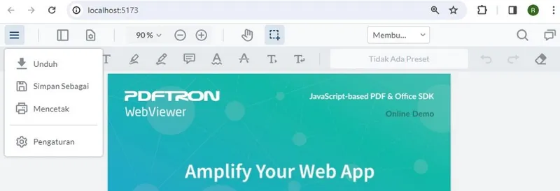
Figure 5 – The UI with the language set to Bahasa Indonesian
Learn about the complete list of available languages.
Setting Dark Mode
A simple, but dramatic, change to the UI can be achieved by modifying the theme. Currently there are just two themes: light and dark, with light being the default.
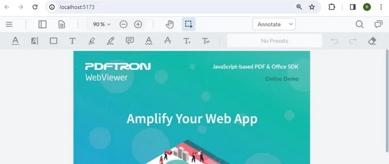
Figure 6 – The default theme, "light"
Changing to dark mode is simply a case of setting the theme to UI.Theme.DARK (if you are using TypeScript you may need to just use “dark”).
const {UI} = instance;

UI.setTheme(UI.Theme.DARK);

// or

// UI.setTheme("dark");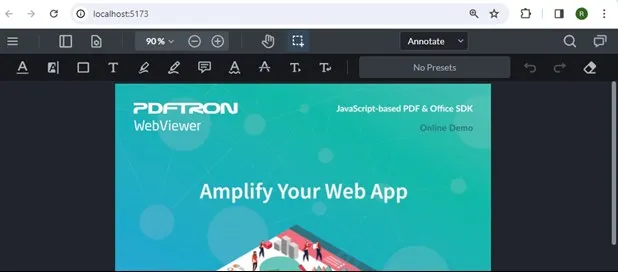
Figure 7 – The dark theme
Altering Menu Options
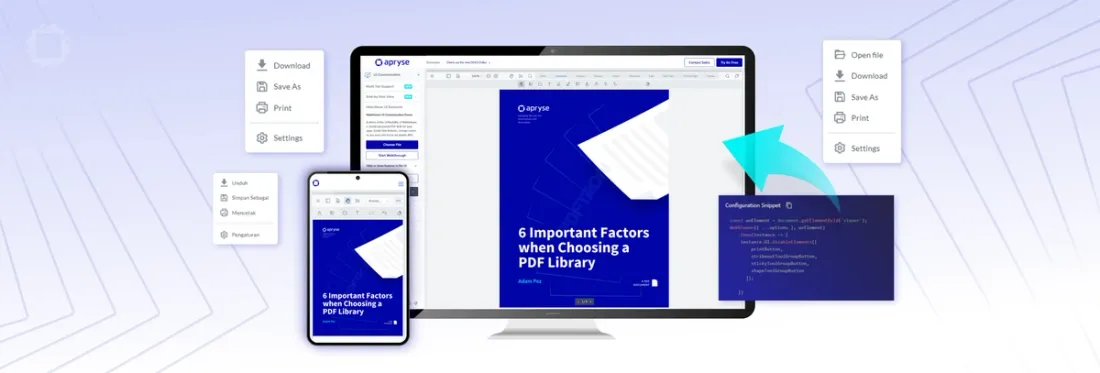
The main “hamburger” menu in WebViewer contains Download, Save As, Print, and Settings by default. That’s often exactly what you want, but let’s imagine that you want to make a change.
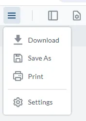
Figure 8 – The default main menu in WebViewer
Let’s look at how we can add a new option – the ability to select a file. We will also look at how to remove the options for downloading, saving, and printing the file.
Enabling a Feature – Adding a FilePicker
WebViewer has the concept of features which control specific functionality. The available features are described here.
Many features are enabled by default, but some are not.
One feature that is not enabled by default is the ability to select the document to be opened in WebViewer. This is controlled by the feature FilePicker.
Enabling it is easy – just include the feature in the array used by UI.enableFeatures.
const {UI} = instance;

const {Feature} = UI;

UI.enableFeatures([Feature.FilePicker]);
Not only does this update the menu to include the ability to open a file, but it also enables the shortcut Ctrl+O on Windows and Cmd+O on macOS.
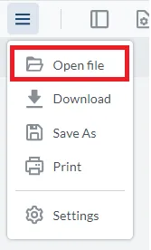
Figure 9 – The main menu with FilePicker enabled
While some features get added to menus, others such as Measurement and ContentEdit add Tool Groups to the header at the top of the WebViewer.
There isn’t a specific documented list of what is and is not enabled, and in any event, it may change over time. Feel free to reach out to Support, or else look at the source code for the Open Source WebViewer UI project.
Disabling a Feature – Removing Menu Items
In a similar way that features can be enabled, they can also be disabled using UI.disableFeatures.
If we want to remove the Download and Print menu items, both of which are features, then we can change our code to:
const {UI} = instance;

const {Feature} = UI;

UI.enableFeatures([Feature.FilePicker]);

UI.disableFeatures([Feature.Download, Feature.Print]);
This will result in an updated menu.
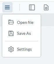
Figure 10 – The main menu after removing the ability to Download and Print
Disabling an Element – Removing Save As from the Menu
Not all menu items are features. For example, Save As is not a feature. As such, you cannot use disableFeatures to remove it.
Instead, a different mechanism – disableElements – is required to remove it from the menu.
To use this mechanism, you need to know the data-element attribute of the html element to be removed.
One way to do this is to use the Dev Tools (F12) in Chrome and inspect the page source. This can be a little tricky for menu items like Save As, because as soon as you click to select them the menu closes, and the element disappears. To work around this, you can enable “Emulate a focused page.“
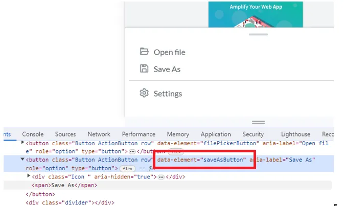
Figure 11 – Finding the data-element attribute for the Save As button
Having found the data-element, this can be used within disableElements.
const {UI} = instance;

const {Feature} = UI;

UI.enableFeatures([Feature.FilePicker]);

UI.disableFeatures([Feature.Download, Feature.Print]);

UI.disableElements(["saveAsButton"])
The menu will now be modified again.
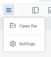
Figure 12 – The menu after removing the Save As button using disableElements
Great. We’re making progress, and the menu is just the way that we want it. Now let’s look at the how to alter the options shown in the header.
The header in WebViewer contains various controls as well as Tool Groups, which I mentioned briefly earlier in this article. These group together controls that have similar functionality.
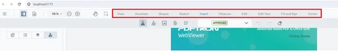
Figure 13 – Tool groups shown in the header of WebViewer
For example, Annotate contains buttons for underlining, highlighting, adding notes, etc.
Removing Options from a Tool Group
Removing buttons from a tool group is just an extension of the ideas that we have already explored. Just as with the Save As button, we need to get the data-element attribute that WebViewer allocated to the control.
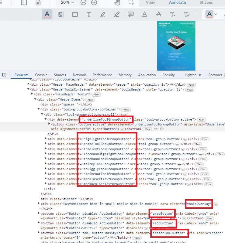
Figure 14 – The buttons associated with the Annotate Tool Group, and the source code showing the data-element attributes
The controls can be disabled by adding those data-element attributes to the list used by disableElements. For example, the following code will remove the first three buttons in the image above.
const {UI} = instance;

UI.disableElements(["underlineToolGroupButton", "highlightToolGroupButton", "shapeToolGroupButton"])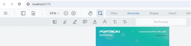
Figure 15 – The UI with the Underline, Shape, and FreeText buttons removed
Updating the Appearance of Existing Elements
WebViewer ships with icons for the various buttons that it contains, and is useable straight out of the box.
It is, however, possible to update both the image and the tooltip (title) associated with the button. For example, you might want to change the highlight button to match a corporate look. To do so, you need to provide a link to the required image and specify a new title.
instance.UI.updateElement('highlightToolGroupButton', {

img: '../../ktip.svg',

title: 'Add highlighting',

})
Reload the project and the icon and tooltip will have changed. Pretty cool, hey?
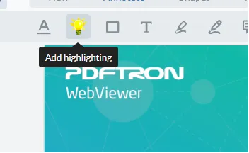
Figure 16 – The highlight tool button with a custom icon and title
Adding Custom Panels
An article about customizing WebViewer wouldn’t be complete without mentioning the ability to add new panels using UI.addPanel. This allows you to specify whatever html you want within the panel, or to reuse an existing panel.
instance.UI.addPanel({

dataElement: 'fooBarElement',

location: left,

render: function() {

var div = document.createElement('div');

div.innerHTML = 'Hello World, foobar panel';

return div;

}

});

instance.UI.openElements(['fooBarElement']);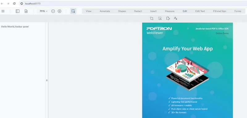
Figure 17 – WebViewer with a custom panel added to the left-hand side
What you do with that panel is up to you. You could implement code to show a list of recent files with thumbnails, or photographs of coworkers, or, in fact, pretty much anything that you can imagine.
Conclusion
Apryse WebViewer unlocks the power of native document viewing and editing within the browser, offering exceptional usability and functionality. With an open-source UI and the ability to easily customize the component in your own code, you can tailor the appearance to fit your own requirements without being locked into the look and feel of a product created by someone that doesn’t understand your business. Whether you are involved in handling documents for Healthcare, Government, AEC, or another industry, you can rely on Apryse WebViewer to give you a solution that fits your needs.
If you’re ready to purchase a license, get in touch with our Sales team, and if you have any further questions, you can visit our Discord to chat with us.
Tags
webviewer
ui customization
javascript

Roger Dunham
Share this post


