Adding a Custom Button to the WebViewer UI with Modular Components
By Roger Dunham | 2024 May 28

9 min
Tags
webviewer
ui customization
modular components
custom button
Summary: Discover the enhanced customization features of Apryse WebViewer 10.7. Effortlessly tailor the UI to your exact specifications, from branding and UI modifications to seamless integration with other systems. No need for source code forking, as the latest update simplifies UI adjustments, ensuring a personalized and polished user experience.
Introduction
Apryse WebViewer is a superb tool offering a wide range of features for viewing, annotating, and manipulating PDFs and other document types. This includes support for digital signatures, form filling, and redaction.
Up to and including WebViewer 10.6, it was already possible to customize the WebViewer UI to meet specific requirements like branding, UI modifications, and integration with other systems. For example, it was easy to show or hide elements, alter titles and icons, or modify the display language or them. For more significant modifications it was also possible to fork the open source WebViewer UI, giving almost unlimited customization options, albeit with greater development effort.
In 10.7 the ability to modify the UI has been greatly simplified, so many users will no longer need to fork the source code to get the look and feel that they require.
In this article, we will work through the steps needed to add a new button to the UI and implement custom functionality.
What We are Trying to Achieve
As an example, we will add a button to the header that allows us to see the text from the current page of the PDF being viewed. An initial document is loaded (based on a file from the WebViewer Showcase), but the ability to pick a file will also be added.
While that is a simple example, the techniques described in this article could be used as the basis of adding buttons to:
- Search, extract, and display the images of digital signatures from a PDF
- Search for text and show bank details from a document, for example
- Display specific layers in a PDF that contains OCGs (Optional Content Groups)
You can also create buttons for any niche business requirements you need to support.
The code within this example is from a React TypeScript project created using Vite, but the principles are the same for other frameworks. The example code is not intended to be production-ready but to outline the steps needed.
Setting Up the Modular UI
By default, the traditional UI is used in WebViewer 10.7. However, switching to the new Modular UI is simple – all you need to do is specify ui:’beta’ in the WebViewer constructor.
 useEffect(() => {

  WebViewer({

   path: 'lib',

   initialDoc: 'files/WebviewerDemoDoc.pdf',

   ui: 'beta' // enable Modular UI

  }, viewerDiv.current as HTMLDivElement).then((instance) => {
At first glance, you may not even know that you are using the new UI. But there are differences since it has been subtly refreshed.
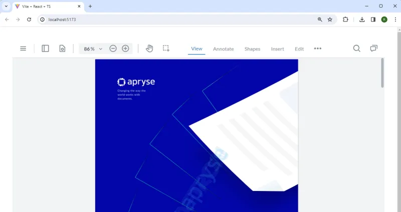
Figure 1 – The first look at the new Modular UI. It is like the older default UI.
However, as soon as you click on items in the tools ribbon group, like Annotate, the changes become obvious. The individual tools all have a fresh new look.
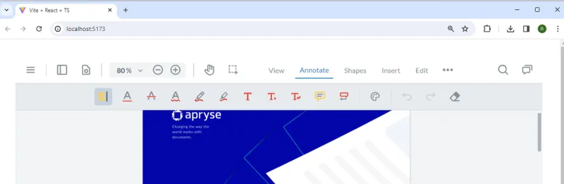
Figure 2 – The fresh new look of tools in the WebViewer Modular UI
Replacing the Built-in Header Menu
We don’t need very much functionality for our example so let’s replace the “normal” top header menu with a custom one, which we will call topHeader. As an example of what can be done, we will also specify that the header menu should be at the left of WebViewer, rather than at the top.
We will add the default main menu (the burger menu) to the header and, using the method UI.enableFeatures, we will add the ability to select a file locally using a FilePicker. This is the same way that you would customize the UI in previous version of WebViewer.
 useEffect(() => {

  WebViewer({

   path: 'lib',

   initialDoc: 'files/WebviewerDemoDoc.pdf',

   ui: 'beta' // enable Modular UI

  }, viewerDiv.current as HTMLDivElement).then((instance) => {

   const { UI, Core } = instance;

   const { documentViewer } = instance.Core;


   UI.enableFeatures([UI.Feature.FilePicker]);


   // @ts-ignore comment.

   const mainMenu = new UI.Components.MainMenu();

  // @ts-ignore comment.

   const topHeader = new instance.UI.Components.ModularHeader({

    dataElement: 'default-top-header',

    placement: 'left',

    grow: 0,

    gap: 12,

    position: 'start',

    setJustifyContent:('center'),

    stroke: true,

    dimension: {

     paddingTop: 8,

     paddingBottom: 8,

     borderWidth: 1

    },

    style: {},

    items: [

     mainMenu,

     // you could add many other items if you wish

    ]

   });

   // @ts-ignore comment.

   instance.UI.setModularHeaders([topHeader]);

  }


  );


 }, [])
After saving the code change, the UI should now refresh, showing our new menu options at the left of the document.
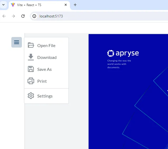
Figure 3 – The UI with the header menu now placed on the left-hand side, with a cut down list of functionality
That’s a great start. The UI already looks very different, and we have removed the options that were not necessary. Now let’s add a custom button to allow us to see the text that is on the currently selected page of the PDF.
We will work through this in stages. First, we’ll look at how to get the text, how to display it in a custom panel, and how to add it to the UI and control it from a custom stateful button.
Getting Text for the Current Page
The text on the current page can be extracted using the following code:
const getTextOnPage = async () => {

const doc = documentViewer.getDocument();

if (doc) {

const currentPageNum = documentViewer.getCurrentPage();

const info = doc.getPageInfo(currentPageNum);

const rect = new Core.Math.Rect(0, 0, info.width, info.height)

const text = await doc.getTextByPageAndRect(currentPageNum, rect);

return text;

}

//if no document is loaded then return an empty string

return "";

}
The way this works is to get the current page from the documentViewer and the size of that page from the doc, then extract the text from that part of the document. Note that we need to use await since getTextByPageAndRect returns a promise.
The returned value is what we want to show the user (or nothing if no document was available).
Displaying the Page Text
There are many things you could do with the document text. It could, for example, be passed to a function of some type to have data extracted from, or to modify it. However, in this case we will just display it to the user by placing it into a custom panel.
We need to specify the dataElement for the panel (which should be unique to the document), plus its location. To demonstrate the option, we will set it to right. We’ll also need a render function that returns either a React component, or HTML directly.
   const createPanel = (txt: string) => {

    //Add a new panel that contains the text

    instance.UI.addPanel({

     dataElement: 'customPanel',

     location: 'right',


     // @ts-ignore comment.

     render: () => {

      return <div className='custom-panel'>

       {txt}

      </div>

     }

    })

   }
So far, we have created a panel that contains text, but it will not be visible.
Making the Custom Panel Visible
Even though we have created the panel, the UI does not know what to do with it. Getting it to appear is a cinch – just call openElements with a list containing the name of the new panel.
instance.UI.openElements(['customPanel']); 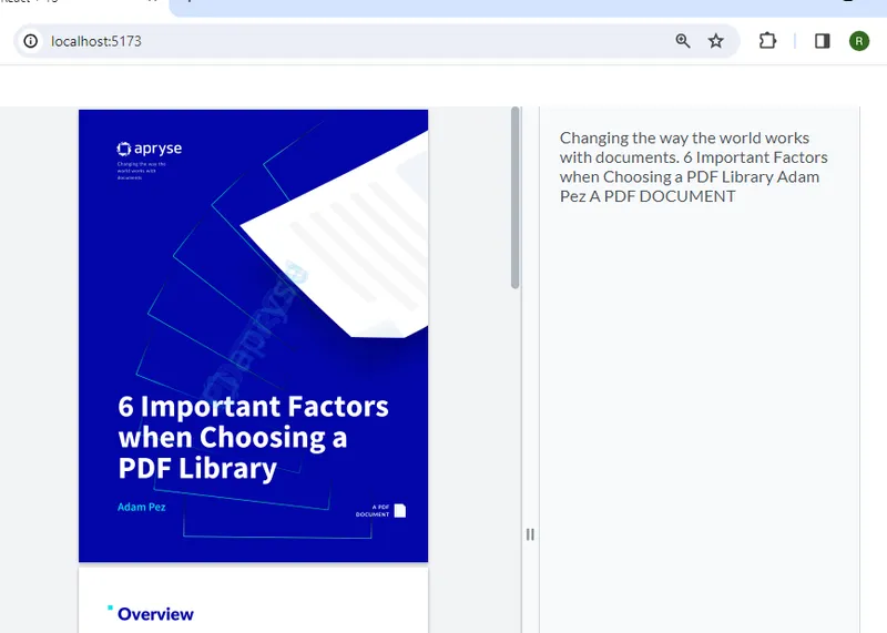
Figure 4 – The modular UI, showing our custom panel with the text extracted from the visible page of the document
Hiding the Panel
Once we have finished with the panel, we can close it simply by calling:
instance.UI.closeElements(['customPanel']);While that will close the panel, the panel we created will still exist and could be reopened. If another panel was created each time a new page became current, this could lead to a resource leak.
There are several solutions to this potential problem. One option is that the panel could be reused, so that as the selected page changes, the text for that page is extracted and the panel could be updated.
In this example code, though, we will just remove the panel when it is closed by getting the list of panels, filtering out the one that we created, then updating the UI’s list of panels using setPanels.
   const removePanelFromList = () => {

    // @ts-ignore comment.

    const panelsList = instance.UI.getPanels();

    // @ts-ignore comment.

    const newList = panelsList.filter(element => element._dataElement != 'customPanel')

    // @ts-ignore comment.

    instance.UI.setPanels(newList);

   }
Putting it All Together
We now have all the code we need to get text from a page, create a panel, show or hide the panel, and finally, remove the panel. The last thing we need to do is create a button that enables the user to control when this occurs. For this example, we will use a StatefulButton (although other options could be used).
This type of button, as the name implies, can have multiple states. Each has a name, a title, an img (which can either be one of the prepared ones, or one that you choose and add to the project), and an onClick event handler, which should specify what the next state of the button should be.
   const myStatefulButton = new instance.UI.Components.StatefulButton({

    initialState: 'Show',

    states: {

     Show: {

      // There are either prebuilt icons, or you can add one to the public folder and reference it

      img: '/files/text-contents-icon.svg',

      title: 'Show',

      onClick: async (update: any) => {

       update('Hide');


       //Get and store the text for the current page

       const txt = await getTextOnPage();

       //Add a new panel that contains the text

       createPanel(txt);

       //Make the panel visible

       instance.UI.openElements(['customPanel']);

      },

     },


     Hide: {

      img: '/files/close-text-contents-icon.svg',

      title: 'Close',

      onClick: (update: any) => {

       update('Show');

       instance.UI.closeElements(['customPanel']);


       // Remove the created panel - alternatively you could write code to reuse the panel and update it.

       removePanelFromList();

      },


     },

    },

    // Mount is a function that gets called when the button is mounted

    // use it to set the initial state or do other setup

    mount: () => { },

    // Unmount is a function that gets called when the button is unmounted

    // use it to clean up any resources

    unmount: () => { },

   });
In this case we have just two states: Show and Hide.
When Show is clicked, the code that we have already looked at is triggered. The text for the current page is looked up, placed into a panel, and the panel is shown. Importantly, update is used to set the state to Hide.
On the other hand, when Hide is clicked, the panel is closed and removed from the list of panels (as we have already seen), and update is used to set the state back to Show.
If necessary, we could also set up initialization and clean up code using mount() and unmount().
The final thing left to do is to add the new button to the list of items that should be in the header menu.
    items: [

     mainMenu,

     myStatefulButton,

     // you could add many other items if you wish

    ]
That’s it – we have a sample that can be used to see the text for any page, and updates the UI. When the UI opens the initial PDF is shown (though you could select a different one using the file picker).
Figure 5 – Our custom UI. When the new button is clicked, the panel containing the text will appear.
You can scroll to any page, then when you click the custom button, the text for that page will appear in the custom panel.
Figure 6 – Our custom UI showing the page content and the custom button to close the panel
Where to Next?
This example is a simple implementation of custom functionality, but the Apryse SDK allows you powerful control over the documents you work with. With more than 25 years of experience, we know that our customers already use our technology to solve problems that we never even imagined existed when we started. Whether you are working in financial services, healthcare, AEC, government, legal, pharma and life sciences, or something else entirely, we have tools that will help you solve the problems that are slowing you down and costing money.
We want you to succeed, so if you run into any issues please feel free to get in touch or contact us on Discord and our brilliant Solution Engineers will be happy to help.
Tags
webviewer
ui customization
modular components
custom button

Roger Dunham
Share this post


