The Font of all Wisdom? How Apryse Handles Missing Fonts
By Apryse | 2023 Oct 18

8 min
Tags
react
font
webviewer
Summary:
In this tutorial, you'll learn how to configure custom fonts in WebViewer. This ensures that documents maintain a consistent appearance across user devices, regardless of installed fonts. And how to achieve visual reliability and professional user experience with these techniques.
Introduction
Fonts are the visual representation of written language, shaping the way we perceive and interpret information, and they possess the power to make or break the impact of a message.
However, different operating systems come with different numbers of fonts available by default. Windows typically ships with more than 100 fonts, macOS around 60, Linux (specifically Ubuntu) and Android ship with at most a few dozen. This means that the same document may look different when viewed on different devices, with one font being switched for another in often unintuitive ways. The consequence of this substitution can range from being trivial to catastrophic with the text flow of the document being altered, and the entire document's appearance being changed.
Furthermore, with over 200,000 fonts available, and still more getting generated, there will clearly be many documents that are written in a font that is not included in the default list.
While it is possible to download some additional fonts, many fonts are available only with a license, so cost may be an issue, along with the physical issues of space for storing those fonts mean that it is not possible to install all the fonts that exist. Even if it was possible, since multiple fonts might have the same name, this could lead to potentially confusing results.
To make matters even worse, there are more than 96,000 characters assigned to endpoints within Unicode, and many fonts map to just a small number (typically a few hundred to a few thousands) characters.
So, this leaves a question. If a document includes text that is in a font that is not available, then how should it be displayed?
In this article we will look at:
- How a document can look different on different machines.
- How to add a set of fonts so that documents look the same on all machines.
- How to add custom fonts so that documents look correct on all machines.
Creating a Test Word Document
Before we go any further, let’s create a Word document that contains many fonts, both common and unusual. The font will contain Some common Windows fonts – Arial, Calibri, Times New Roman, and Comic Sans, but we will also add three extra fonts, one called ‘Wassail’, another called ‘Mystical Woods’, and finally ‘Algerian’.
The purpose of doing this is just to have a range of fonts that look different from each other.
On the machine where it is created it will look something like this:

Figure 1 - Image of the Word document when first created.
However, if that file is opened on a machine where one of the fonts (in this case ‘Wassail’) is not available, then Word will automatically replace it with a substitute, so that the document does not look as expected.
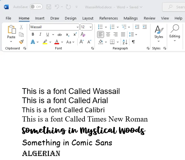
Figure 2 - The same document opened on a machine where the font 'Wassail' is not available. The first line is now using a different font.
If you delve into the advanced options for Word, then you can see what substations have occurred, and you even have the option to modify this mapping.
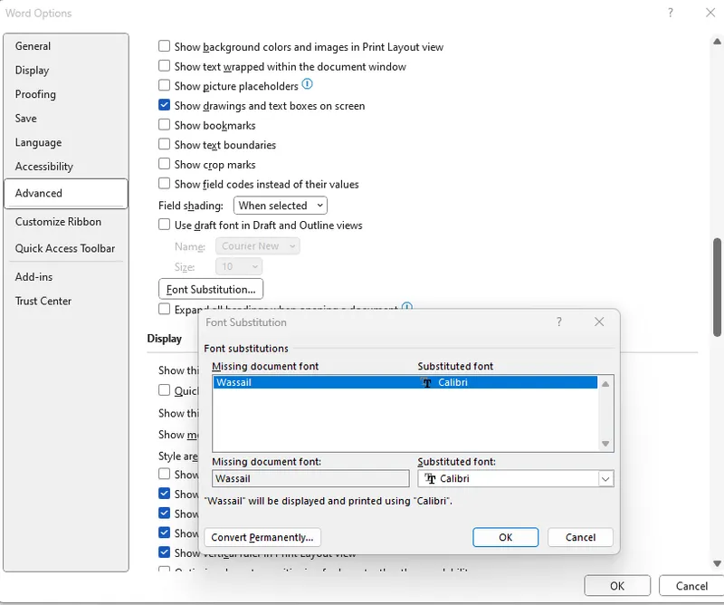
Figure 3 - The font substitution dialog for Word. In this case, Calibri was substituted for Wassail.
To make this even worse, font substitution also occurs in other document editors such as LibreOffice, but using different substitution rules, so the document could end up looking like this:
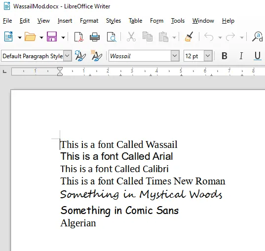
Figure 4 - The same file in LibreOffice - with different font substitutions.
This means that although we created a document that looked exactly the way we wanted, we actually have no idea how it will look on a user’s machine. That could be very disappointing. It is even possible that the substituted fonts not just look different, but might also be a slightly different size causing pages to break in different places on different machines.
Creating a Document That Looks the Same to Everyone
One way to do this is to embed the fonts into the file, but this can lead to very large files, and not all fonts can be embedded due to licensing restrictions.
Another option is to is to convert the document into a PDF. That is often a great option, and Apryse can help with that. However, unless you convert to PDF/A there is still a risk of the result looking different to different people, since even with PDFs the viewer may substitute fonts that are not available.
It looks like a different way is needed.
Using the Apryse WebViewer to Show the Document
The Apryse showcase is a great way to see how a Word document can be rendered within the browser. However, the showcase, by itself, will not necessarily show consistent results for all users since, by default, the WebViewer uses locally installed fonts.
Steps Towards Making a Consistent Document
For this article we will be using a machine that does not have the fonts Wassail, Mystical Woods or Algerian installed and we will go through the steps to create a version of the web viewer that does give consistent results.
The code is based on the React sample, but the same results will occur if you use any of the other mechanisms for creating a WebViewer – including Vue, Nuxt, Svelte, Electron, Blazor or pure JavaScript.
To simplify looking at fonts we will make a few changes to the code.
- Remove the initial Document
- Remove the code for drawing a rectangle
- Enable the user to choose a file by adding a FilePicker option.
- Add the license key that we got from Apryse. If you don’t have one yet then you get one here.
Next run npm I, then run npm start to get the WebViewer web page running.
Finally use the FilePicker to open the document that contains a range of fonts.
On the host machine it will look something like this:
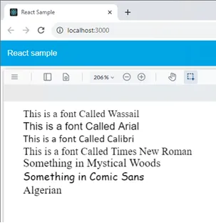
Figure 5 - The sample document in the Apryse WebViewer on machine that does not have some of the fonts installed.
We can see all of the words, but the fonts are definitely not correct. The very first line should have that big, bold Wassail font, and instead it looks like Times New Roman.
This is because the fonts that are being shown depend on what fonts are installed on the user’s machine. On an Android device the results may look different again, with the Comic Sans text also being incorrect.
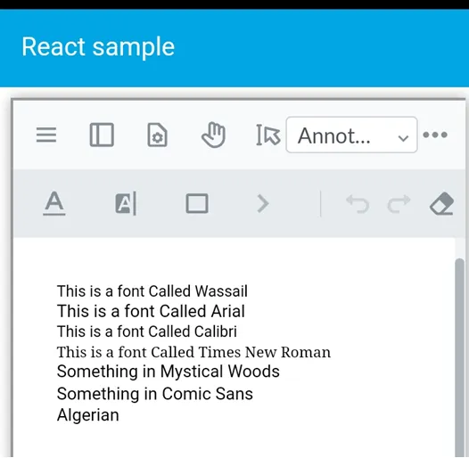
Figure 6 - the same file opened on an Android phone – Comic Sans is no longer correct.
Showing Consistent Fonts using WebViewer and the Self Service Fonts Package
There is some great documentation available here, which describes how to set up a folder and server that will supply fonts as required so that the result is consistent for all viewers irrespective of what fonts are installed locally.
Let’s have a look at how to do this on our machine.
First you download the Self Serve Font Package from here. This is a zip file that contains more than 90 common fonts (both compressed and uncompressed) which can be used by WebViewer.
For the mechanism to work, the zip file needs to be unpacked into a folder, and that folder needs to be accessed via a URL.
You are likely to run into CORS issues if you do not configure the font server correctly. When it comes to deployment for production there will be a platform specific way to do this, but for testing purposes you can use http-server (which can be installed using npm) running on port 8000 of the localhost using:
http-server -p 8000 --cors
You may also need to configure your firewall to permit access to the server.
Before going any further it is worth checking that the font server is working. You can do this my navigating to localhost:8000 – and ensuring that you can see a list of fonts.
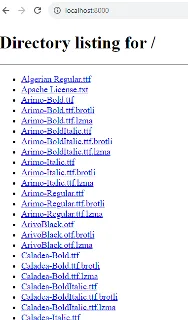
Figure 7 - Typical output when viewing the font server URL.
It would be wise to also test this on a different machine to ensure that the Firewall is correctly configured.
In order to use these fonts, you need to tell WebViewer where they are located. This is done by creating a configuration file if one does not already exist. The file is typically called config.js file. Within that file you will need to specify the URL for the font server using Core.setCustomFontURL([URL of server]).
Important make sure that the URL ends in a slash.
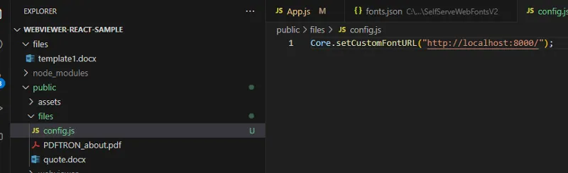
Figure 8 - An example of setting the path to the Font server. In this example it is on a local machine. For production use it may well be in the cloud.
Next, the WebViewer constructor needs to contain the location of the config file.
useEffect(() => {
    WebViewer(
      {
        path: '/webviewer/lib',
        config: "files/config.js"
      },
Finally restart the React sample, and reopen the document.
If you see CORS errors in the log file within the F12 Developer Tools, then you need to enable CORS for the http server that is providing the fonts.
The document will now look the same on all machines.
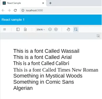
Figure 9 - The output on a machine that actually has some of the fonts available, when CustomFontURL is used. Note that Comic Sans is no longer correct, even though the font is installed.
WebViewer is now getting fonts from the font server when one is needed. The fonts.json file specifies what fonts are available, and also what alternatives to use if an exact match isn’t possible.
However, although the output is consistent, it still doesn’t look the way that we intended, since several of the fonts are not in the pre-built list of around 90 fonts.
Adding Extra Fonts – Going from Consistent to Correct
Fortunately it is easy to add extra fonts and customize the font set.
We have said that the matching and substitution of fonts is done using the fonts.json file, and part of the process for adding new fonts involves modifying that file. While that can be done manually, the file has a complex format which needs to be correct for it to work.
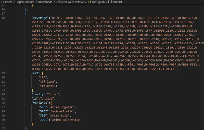
Figure 10 - Part of the fonts.json file illustrating some of its complexity.
To make adding fonts simpler a command line tool, WebFontCreator, is available for Linux, Mac, or Windows which will take the set of fonts that are present and generate a suitable file.
Adding a Custom Font to Fonts.json
Let’s add the Wassail font to the list of available fonts.
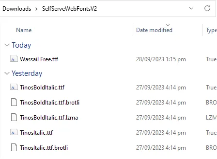
First download the font as a .ttf file and drop it into the folder which contains the list of fonts that we are currently serving. Note that WebFontCreator expects fonts to have a lower-case file extension, so please rename the downloaded font if it has an upper-case extension.
Now in a PowerShell terminal enter
./WebFontCreator [path to the fonts folder]
for example
./WebFontCreator 'SelfServeWebFontsV2'
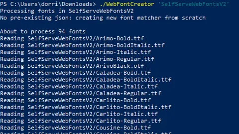
Figure 11 - Typical output from the WebFontCreator tool
This will read all of the fonts that are already present in the folder, then find any new ones, compress them, and add them to the fonts.json file. It is as simple as that.
Restart the font web server.
If we now look at the document in WebViewer (you may need to clear the cache) we see:

Figure 12 - The sample document after adding 'Wassail' to the fonts server. The top line is now correct.
Great, we have one of our custom fonts added!
Adding the Rest of the Fonts
Let’s add the other fonts that are not rendering correctly on an Android device.
We need to find Algerian, Comic Sans and Mystical Woods font files and copy them into the folder from which the fonts are being served.
Having done that, run WebFontCreator again.
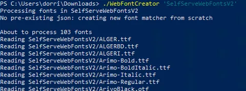
Figure 13- The result of running the WebFontCreator tool after adding Algeria, Comic Sans and Mystical Woods. Note that there are now 103 fonts. Note also that the file extension for the Algerian fonts needs to be manually changed to lower-case.
We now have all of the fonts in the fonts.json file. Great work!
Restart the font server again, clear your browser cache, and reopen the document in WebViewer.
The document now looks great with all the correct fonts, even though it is now running on a machine that does not have all the fonts installed. That’s pretty good.
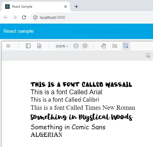
Figure 14 - The document viewed on a Windows machine.
What’s more, the file looks the same on an Android phone where very few fonts are installed.
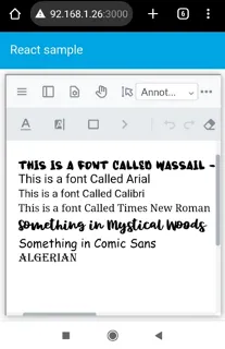
Figure 16 - The document when viewed on a mobile Android device. The fonts look the same, even though they are not locally available.
That’s a great result! All users now have a document that looks the same, irrespective of what fonts they have installed.
Conclusion
We have seen how fonts can easily be made available, providing fast self-service support for any fonts that are required. While we have only looked at English language fonts, exactly the same mechanism can be used for other language fonts including Asian ones.
What’s more if you have a font associated with your brand, then it does not need to be distributed to end users – it can just be made available on the font server and provided as required.
When you are ready to take the next steps, see the documentation for the SDK to get started quickly. Don’t forget, you can also reach out to us on Discord if you have any issues.
Tags
react
font
webviewer

Apryse
Share this post


