Introducing WebViewer's New Modular UI: Enhanced Accessibility and Customization
By Peter Hawker | 2024 Jun 20
4 min
Tags
webviewer
ui customization
Summary: The new Modular UI in WebViewer enhances the clean interface with improved accessibility and a consistent design language. It turns buttons, headers, panels, and flyouts into modular components that can be easily customized and assembled. This approach allows for faster POCs, integration, and time to market, making your application feel bespoke. The Modular UI consists of four categories: Items, Containers, Panels, and Flyouts, all supporting extensive customization and seamless integration.
Introduction
Earlier this year, we released a preview of the new WebViewer UI, which will ship with our next major version of WebViewer later this fall. Our last major UI refresh was several years ago and though we’ve made countless improvements to the UI over that time, customer feedback pointed us to a new approach.
Introducing WebViewer Modular UI
From a design perspective, the Modular UI refines the clean, out-of-the-box UI that WebViewer ships with while improving accessibility through consistent design language.
On the technical side, Modular UI turns buttons, headers, panels, and flyouts into Lego block-like components that can be quickly and easily assembled to fit your desired design. We chose this approach to enable fluid customization that feels bespoke to your application while allowing for faster POCs, integration, and time to market.
Benefits
- Customization: Using modular and reusable components allows for faster customization of the WebViewer UI
- Structure and Content: Items (e.g., buttons, controls) can be placed within Containers (e.g., headers, menus) to build the UI structure.
- Flexibility: Modify the default WebViewer UI or create a new one from scratch using high-level components like Containers and Items.
- Ease of Use: Enabling the Modular UI is simple by setting the UI property to 'beta' in the WebViewer constructor.
Read more about how to get started with the Modular UI in our Modular UI documentation.
Learn how to add a custom panel to a Tab Panel and make the Tab Panel accessible via a custom button in the header — all using the Modular UI.
Component Breakdown
The Modular UI has been broken down into four categories of components:
- Items
- Containers
- Panels
- Flyouts
Modular items, such as buttons and toggles, provide dynamic interactions with customizable properties. Modular containers, including headers and grouped items, organize these items into structured layouts. Panels display additional content, like Thumbnails and Bookmarks, on the viewer's sides and can be custom-built or prebuilt. Flyouts are pop-up menus that appear upon user interaction, containing various items and supporting submenus for deeper navigation. These components collectively create a flexible and responsive UI.
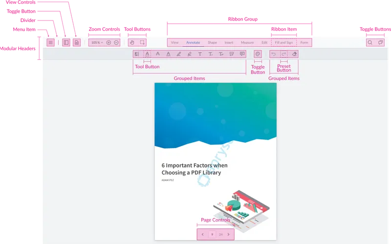
Items
Modular items are the building blocks of interactable elements within your UI. Items include buttons, controls, and toggles that can be placed within containers to build the UI. Item can be customized with properties like icons, labels, and specific actions.
Here’s an overview of how they work:
Key Features and Types
- Action Buttons: Perform specific functions like saving, printing, or custom actions defined by the developer. These buttons can have icons and labels to indicate their purpose.
- Stateful Buttons: Manage states within the application, such as toggling between different tools or modes (e.g., pan, zoom, annotation tools). They visually indicate the current state to the user.
- Toggle Buttons: Control the visibility or activation of UI elements. For example, a toggle button might show or hide a side panel or switch a feature on and off.
- Tool Buttons: Tool buttons are used to activate a specific tool such as the highlight tool. In the Modular UI, these are abstractions that can be used to easily add a tool button anywhere in the UI
- Prebuilt Items: Include common actions and controls such as navigation buttons (e.g., next page, previous page), zoom controls, and other frequently used UI elements. These come with default behaviors but can be customized.
Customization and Integration
- Customization: Each item can be customized with properties like `type`, `dataElement`, `title`, `icon`, and `onClick` functions. This allows developers to define the appearance and behavior of each item precisely.
- Integration with Containers: Items are placed within containers such as headers, toolbars, or side panels. This hierarchical structure helps in organizing the UI logically and ensures that items are accessible in the right context.
- Dynamic Management: Items can be dynamically added, removed, or modified at runtime. This dynamic capability is crucial for creating responsive and adaptable interfaces that can change based on user actions or application state.
Read more about how to work with items in our Modular UI documentation.
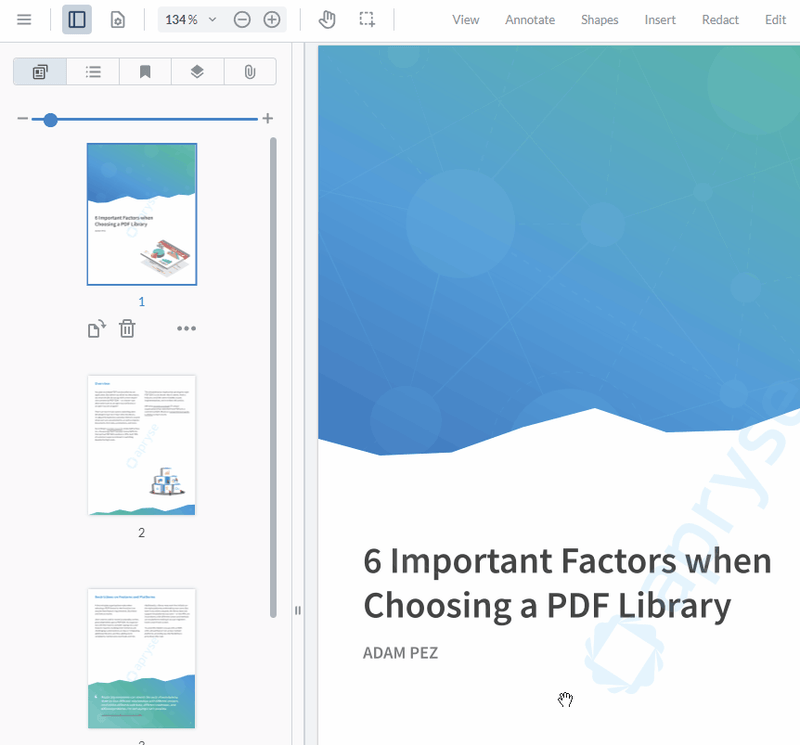
Containers
Modular UI containers are the organizational components that are responsible for creating structured interfaces.
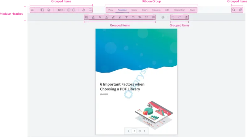
These containers include Modular Headers, Grouped Items, and Ribbon Groups:
- Modular Headers: Serve as flexible top-level containers that can house other containers and items, allowing for various placements and customization.
- Grouped Items: Function like flex-box containers, holding multiple items and enabling complex layouts within the UI.
- Ribbon Groups: Specialized containers that hold Ribbon Items, maintaining a consistent style for toolbars and ribbon interfaces.
These containers support dynamic updates, making it easy to add, modify, or remove components and adjust their layout. By using these containers, developers can create intuitive and adaptable UIs that cater to diverse user needs and interactions.
Read more about creating containers in our Modular UI Containers documentation.
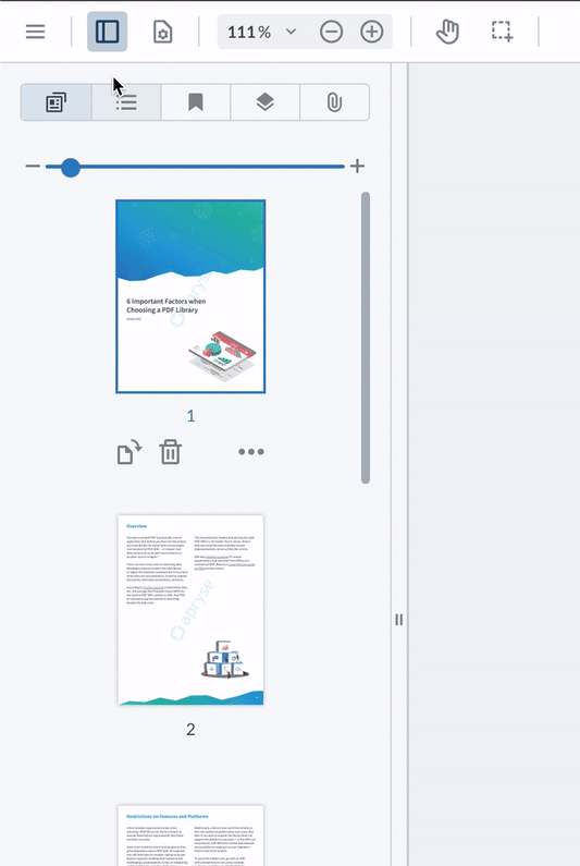
Panels
Modular panels enhance user interaction by displaying auxiliary content on either side of the viewer. These panels are highly customizable, allowing for the integration of both prebuilt and custom panels.
Key Features
- Prebuilt Panels: Includes Thumbnails, Outline, Bookmarks, and other commonly used panels. These can be easily added to the viewer using the addPanel API.
- Custom Panels: Developers can create custom panels using JavaScript or React, providing flexibility to meet specific needs. These panels can display any content, from custom UI elements to interactive widgets.
- Tabbed Panels: Multiple subpanels can be organized within a single panel using tabs, effectively managing screen space and enabling users to switch between different panel views seamlessly.
- Dynamic Management: Panels can be dynamically added, modified, or removed during runtime, allowing the interface to adapt to changing requirements or user preferences. This dynamic capability is essential for creating responsive and interactive applications.
- Flexible Locations: Panels can be positioned on either the left or right side of the viewer, and their positions can be adjusted programmatically or through user interaction. This flexibility ensures that the UI can be tailored to provide an optimal user experience.
Read more about working with built-in panels and how to create your own in our Modular UI Panel documentation.
Flyouts
Modular flyouts offer a dynamic way to display additional UI elements and options without cluttering the main interface. Flyouts are essentially menus that appear when users interact with specific UI elements, like the hamburger menu in the out-of-the-box UI.
Key Features
- Customizable Content: Flyouts can include various items like buttons, toggles, and other controls, allowing for a rich and interactive user experience. Each item within a flyout can be customized with icons, labels, and actions.
- Submenus and Nested Items: Flyouts support the creation of submenus, enabling deeper navigation and organization of options within a compact space. This feature is particularly useful for grouping related actions and controls.
- Creation and Management: Flyouts are created using the UI.Components.Flyout class and integrated with the UI.Flyouts.addFlyouts method. This method allows for the addition, removal, and updating of flyouts dynamically, providing flexibility in managing UI components.
- Positioning and Display: Flyouts can be positioned relative to their triggering element, ensuring they appear in an intuitive and accessible location for users. The positioning can be adjusted based on the UI layout and user interactions.
- Event Handling: Flyouts can be linked to specific events or user actions, such as clicks or hovers, making them responsive to user behavior. This interactivity enhances the overall user experience by providing context-sensitive options.
Read more about creating your own flyouts in our Modular UI Flyouts documentation.
Putting it all Together
Depending on the level of customization that you’re after, you can interact with the modular components using specific APIs or by importing and exporting an entire UI configuration.
APIs
You can use APIs to interact with the UI at runtime to create, modify, and remove components from the UI.
For example, this snippet creates a new instance of the rectangle tool and adds it to the default top header using APIs.
const { Tools } = instance.Core;
const rectangleToolButton = new instance.UI.Components.ToolButton({
  dataElement: 'rectangleToolButton',
  toolName: Tools.ToolNames.RECTANGLE,
});
// This can now be added to a modular header
const defaultHeader = instance.UI.getModularHeader('default-top-header')
defaultHeader.setItems([rectangleToolButton]);
In the following example, an instance of the thumbnail panel is added to open on the left, and a button is added to the header to toggle the panel.
// Thumbnail Panel
instance.UI.addPanel({
  dataElement: 'thumbnailPanel',
  location: 'right',
  render: instance.UI.Panels.THUMBNAIL,
});// Using the toggle button to open the Thumbnail panel
const thumbnailPanelToggle = new instance.UI.Components.ToggleElementButton({
dataElement: 'thumbnailPanelToggle',
toggleElement: 'thumbnailPanel',
img: 'icon-header-sidebar-line',
title: 'Thumbnail Toggle Panel',
});
// Then this button should be added to a container's item using the setItems API.
// This container can be a modular header or a grouped items container.
const defaultHeader = instance.UI.getModularHeader('default-top-header')
defaultHeader.setItems([thumbnailPanelToggle]);Read more about the available APIs in our Modular UI documentation.
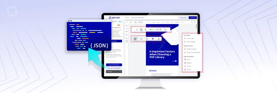
UI Import/Export
You can also import and export your UI configuration by defining your UI components, headers, panels, and flyouts within a JSON structure.
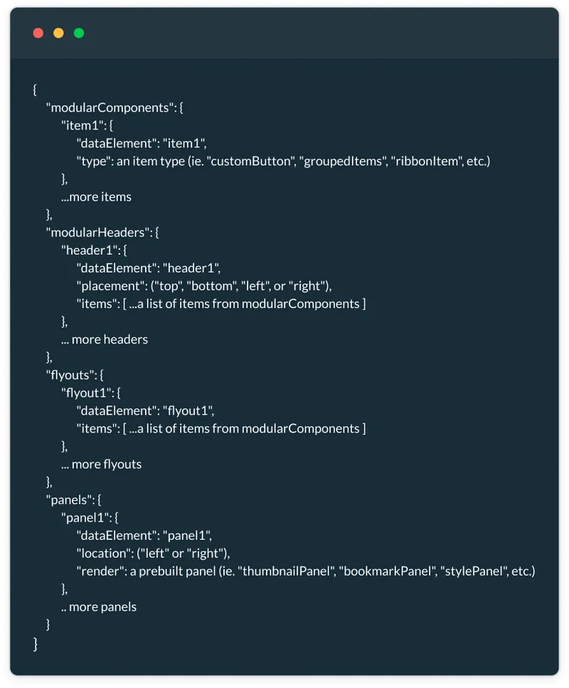
Importing and exporting via JSON enables easy customization and management of different UI configurations to match different users:
Importing
- Use the UI.importModularComponents(json, functionMap) method.
- JSON defines components, headers, panels, and flyouts.
- Use function maps to handle custom functions and behavior.
Exporting
- Uses the UI.exportModularComponents() method.
- Generates a JSON object with the current UI configuration.
- JSON can be edited, saved, and reused.
Read more about importing and exporting UI configurations in our Modular UI Import-Export documentation.
Wrap up
We hope you found this overview of the Modular UI beta for Apryse WebViewer insightful and are excited about the upcoming launch later this year.
Try it out yourself in the Webviewer Showcase.
We'd love to hear your thoughts and suggestions to help refine the product experience. We're looking forward to delivering a feature-rich and customizable solution that meets your needs. Please share your feedback and let us know how we can make this even better for you.
Our solution engineers are available to support your implementation on Discord or through our support portal.
Tags
webviewer
ui customization

Peter Hawker
Product Management
Share this post