Using Custom Panels with Apryse WebViewer Modular UI
By Roger Dunham | 2024 Jun 06
9 min
Tags
ui customization
webviewer
javascript
Introduction
Apryse WebViewer offers a superb document processing experience whether you are viewing a document, editing it, adding annotations, or even redacting. The UI is also open-source, making it possible for users to modify the UI since 2018.
Earlier this year we released the WebViewer Modular UI, which enables you to update the user experience via configuration rather than customization (though you can still fork the code and customize it if you wish).
We have previously seen how to add a custom panel that is opened or closed using a button in the header.
In this article, we will look at how we can add a custom panel into a Tab Panel, and then make the Tab Panel accessible via a custom button in the header – all using the Modular UI.
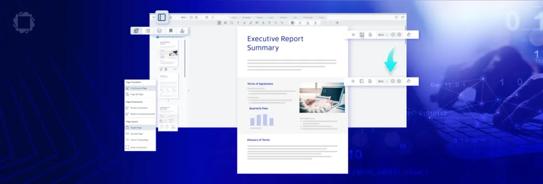
Experience the future of document viewing with WebViewer’s Modular UI.
The Story so Far
We have already seen how we can create a panel that shows the content of the currently selected page.
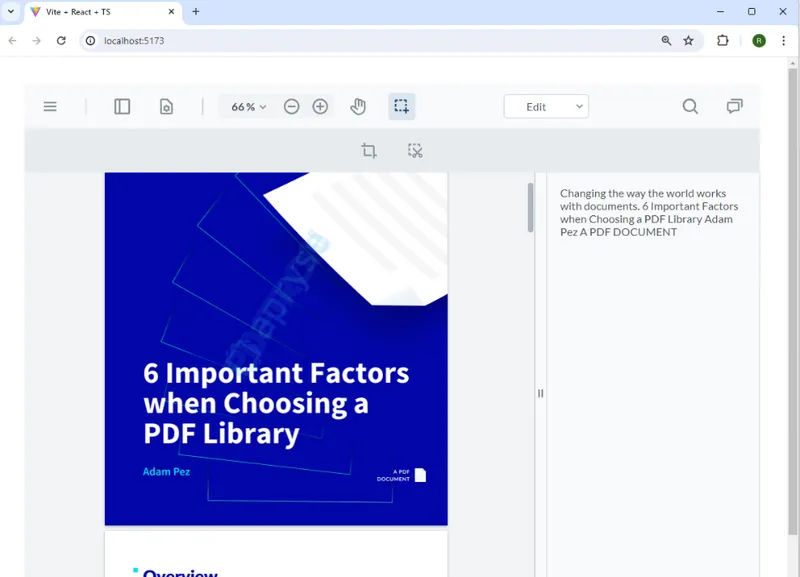
Figure 1 – An example of creating a custom panel in WebViewer
This was implemented via a React component, which used a callback to get the text for the currently selected page in the PDF.
   const getTextOnPage = async () => {

    const doc = documentViewer.getDocument();

    if (doc) {

     const currentPageNum = documentViewer.getCurrentPage();

     const info = doc.getPageInfo(currentPageNum);

     const rect = new Core.Math.Rect(0, 0, info.width, info.height)

     const text = await doc.getTextByPageAndRect(currentPageNum, rect);

     return text;

    }

    else {

     //if no document is loaded then return an empty string

     return "No document";

    }

   };
While the example only extracted the text on the page, it could easily be modified to provide a range of other functionality. For example, getting the links on the page, searching the text for bank account details and displaying them, or hundreds of other real use cases.
While it is easy to add a new panel, it’s not a scalable solution. One extra panel is fine, but if we added many new panels – each displaying a single specific type of information from the document – we would very quickly run out of screen real estate.
This is where Tab Panels, and the ability to hide panels, comes in handy.
Enabling Modular UI
In WebViewer 10.8, the Modular UI is not enabled by default. The creation of a custom panel doesn’t require it, but the next step – easily creating a Tab Panel – does.
Enabling Modular UI is easy. You just need to specify ui:'beta' in the WebViewer constructor.
 WebViewer(

   {

    path: '/lib',

    licenseKey: 'YOUR_LICENSE_KEY',

    ui:'beta',

   },

   viewer.current,

  ).then((instance) => {

// rest of your code
The Tab Panel
Tab Panels have been available in the WebViewer UI for a while. In fact, one is used to display thumbnails, bookmarks, layers, and other information in the classic UI.
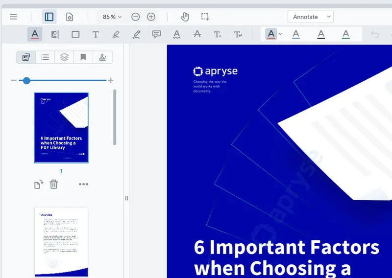
Figure 2 – The default Left Panel in WebViewer. It is a Tab Panel containing thumbnails and other information.
With the arrival of the Modular UI, though, they have become simpler to use.
The Tab Panel constructor requires the following:
- dataElement (string, required): A unique string that identifies the panel
- location (string, 'left' or 'right', required): The location to place the panel
- The list of panels that should be included
The list of panels needs to hold information about each panel. This can include a dataElement (to allow the panel to be referred to by name), an icon, and an obligatory render function. Before we move on, let’s look at what is included with WebViewer.
WebViewer ships with many prebuilt panels, which can be enabled just by using their name:
- Outline
- Signature
- Bookmarks
- File Attachment
- Thumbnail
- Layers
- Text Editing
- Change List
- Style
- Redaction
- Search
- Notes
- Tabs
- Signature List
- Rubber Stamp
- Portfolio
All the prebuilt panels are ready to use and include a render function.
Custom panels can also be used but must have a render function defined. But that’s not an issue – we saw how to do that in the previous article.
For now, though, we will add an icon (which will be a kiwi, just because I like them) and a title to the custom panel that we created in the previous post.
   const createPanel = () => {

    //Add a new panel that contains the text

    instance.UI.addPanel(

     {

      dataElement: 'customPanel',

      location: 'right',

      icon: '/kiwi.svg',

      title: 'Custom Panel',

      // @ts-ignore

      render: () => <TextContentPanel getTextOnPage={getTextOnPage} documentViewer={documentViewer} />,

     });

   }
We will now create a Tab Panel using two of the prebuilt panels (Thumbnail and File Attachment) and our custom panel. This is done by using the keyword render: followed by the name of the panel (either as a string or as a constant).
   const tabPanel = new instance.UI.Components.TabPanel({

    dataElement: 'myTabPanel',

    location: 'right'

    panelsList: [

     {

      render: instance.UI.Panels.THUMBNAIL // or 'thumbnailsPanel'

     },

     {

      render: instance.UI.Panels.FILE_ATTACHMENT // or 'fileAttachmentPanel'

     },

     {

      render: 'customPanel'

     },

   ],

   });
For our custom panel, we just specify render and the name of its dataElement.
IMPORTANT: We must add the name of the new panel (not its dataElement) to the list of panels that WebViewer knows about. If you forget this step, the panel will not open.
instance.UI.addPanel(tabPanel); 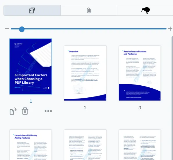
Figure 3 – Our newly created Tab Panel. Our custom panel with the kiwi icon is at the right-hand side since it was the last item in panelsList.
A question that many customers have asked is how to change the order of panels within a Tab Panel. Until now, that has been difficult to achieve.
However, with the Modular UI, it is as simple as changing the order in which panels are added to the panelsList.
For example, if we change our code so that our custom panel is added first:
   const tabPanel = new instance.UI.Components.TabPanel({

    dataElement: 'myTabPanel',

    location: 'right'

    panelsList: [

     {

      render: 'customPanel'

     },

     {

      render: instance.UI.Panels.FILE_ATTACHMENT // or 'fileAttachmentPanel'

     },

     {

      render: instance.UI.Panels.THUMBNAIL // or 'thumbnailsPanel'

     },

   ],

   });
Then, when we refresh the browser, the order of panels has also changed.
Figure 4 – The Tab Panel with a modified order of panels. Now our custom panel with the kiwi icon is first.
Configuring the Controls in the Modular Header
Let’s take a moment to understand how to add buttons (and other controls) to the Modular Header.
By default, the header is at the top of the viewer. However, it doesn’t have to be there – it could be at the sides or bottom. But for now we will leave it at the top.
As an example, let’s replace all the header tools with a simple set of four buttons: the main menu, view controls, a zoom control, and a button to let us pan around the document.
First, we need to define some constants that relate to the controls that we want to add. The main menu, view controls, and zoom controls are all directly available as prebuilt classes.
The Pan button isn’t a prebuilt class. Instead, it is created as a generic Tool Button – but with the tool name specified using a Tool.ToolsNames enum to define what it does (in this case, pan).
  // Menu Flyout Button

   const mainMenu = new UI.Components.MainMenu();

   // View Controls

   const viewControlsToggle = new UI.Components.ViewControls();

   // Zoom Controls

   const zoomControls = new UI.Components.Zoom();

   // Pan Tool Button

   const panToolButton = new UI.Components.ToolButton({

    dataElement: 'panToolButton',

    toolName: Tools.ToolNames.PAN,

   });
Next, we create a new Modular Header, specify various parameters, then add the controls to its items array.
   const topHeader = new instance.UI.Components.ModularHeader({

    dataElement: 'default-top-header',

    placement: 'top',

    grow: 0,

    gap: 12,

    position: 'start',

    stroke: true,

    dimension: {

     paddingTop: 8,

     paddingBottom: 8,

     borderWidth: 1

    },

    style: {},

    items: [

     mainMenu,

     viewControlsToggle,

     zoomControls,

     panToolButton,


    ]

   });
Modular UI lets us easily specify the layout of the header’s content. As an example, we will center it.
   // We can also modify the justification in the header so it's centered

   topHeader.setJustifyContent('center')
Finally, we need to call setModularHeaders, passing in the header object that we have just created.
   // Set the modular header in the UI

  instance.UI.setModularHeaders([topHeader]);
When we refresh the browser, the default header that we saw previously will have been replaced with our new Modular Header (and anything that was not defined in our new header will be missing).
In a future article, we will look at how to include the Ribbon Group, but for now we will keep things simple and just use our four controls. But even with just those we still have lots of functionality.
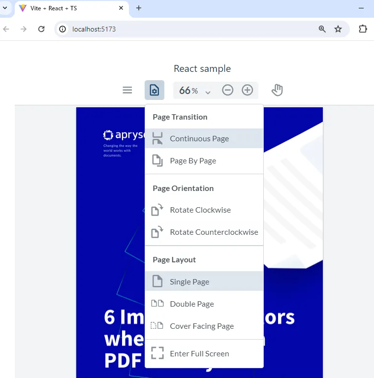
Figure 5 – The UI with our custom header with a limited set of controls. But they work exactly as you are used to.
Creating the Toggle Button in the Header
The final part of the puzzle is how to toggle the visibility of the Tab Panel. We looked at this briefly in a previous blog post where we had just a single stateful button. Here, we will use a ToggleElementButton to show or hide the panel.
   const tabPanelToggle = new instance.UI.Components.ToggleElementButton({

    dataElement: 'tabPanelToggle',

    toggleElement: 'myTabPanel',

    img: 'icon-header-sidebar-line',

    title: 'Toggle Tab Panel',

   });
The code is intuitive, but there are a few things to be aware of:
toggleElement is string based and needs to match the dataElement for the panel that you want to toggle.
img can either be a local image file (in the same way that we specified the kiwi image) or one the icons built into WebViewer.
Finally, we just need to add our new button to the list of items in the ModularHeader. As we saw earlier, since the display order will match the order of items in that list, you are able to control the display.
 // code from earlier snippet

style: {},

  items: [

  mainMenu,

  tabPanelToggle,

  viewControlsToggle,

  zoomControls,

  panToolButton,

  ]

 });
Now we have a set of buttons, the order of which we can control, and when we press on our new button our new panel opens.
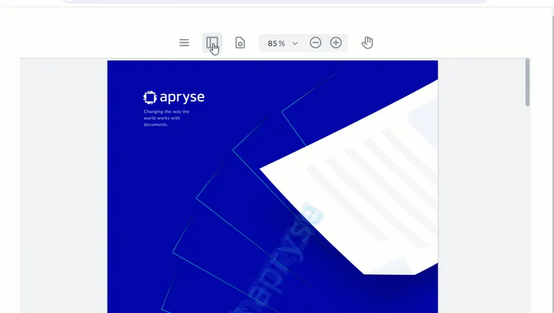
Figure 6 – The final result: We can toggle the new Tab Panel.
Where to Next?
The WebViewer Modular UI is extremely powerful – allowing you to rapidly configure the way WebViewer looks.
Currently, we have left the header at the top, but since a Modular Header can easily be located at the left, right, or bottom of the page, we can change the appearance entirely, simply by setting the following:
placement: 'bottom', And with no further effort, the controls are now at the bottom of the viewer.
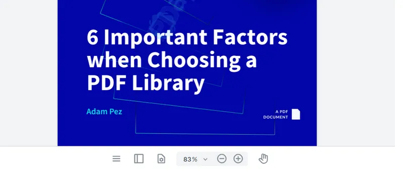
Figure 7 – An example of putting a Modular Header at the bottom of WebViewer
With WebViewer and Modular UI, you have access to a wealth of functionality and a UI where significant customization can be performed in minutes. Check out the Modular UI documentation.
This means that you can now offer your users an experience with powerful functionality that also matches your company look.
Conclusion
When you are ready to get started, see the documentation for the SDK to get going quickly. Don’t forget, you can also reach out to us on Discord if you have any issues.
Tags
ui customization
webviewer
javascript

Roger Dunham
Share this post


