Isaac Maw
Technical Content Creator
Published August 13, 2025
Updated January 26, 2026
5 min
5 Essential Features to Make Your Web App Accessible
Isaac Maw
Technical Content Creator
Summary: Accessibility improves usability for everyone. Here are 5 essential features you can add today to make your web app WCAG 2.2 compliant.
Web accessibility benefits all users. In addition to making your platform usable by more of the 1.3 billion people who experience significant disability, accessibility features make your web app more usable for those who choose to accessibility tools to speed their workflow, such as keyboard navigation, or make their experience more comfortable, such as users who are experiencing a temporary disability, such as a migraine or a broken arm.
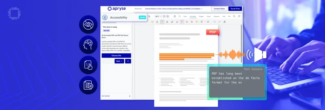
With our Summer 2025 Release, we upgraded the UI of our Web SDK, including PDF, DOCX and Spreadsheets to WCAG 2.2 Level AA compliance. This high level of accessibility compliance goes above and beyond WCAG 2.1, which is required by most government regulations, including the European Accessibility Act.
Semantic HTML
Using semantic html, where the element clearly describes its meaning to both the browser and the developer, is essential for accessibility tools such as screen readers and keyboard navigation. For example, elements such as <div> and <span> are not semantic, while <img>, <table> and <section> are semantic. Another important example is heading levels, such as <h1> and <h2>. These help screen readers understand how content is laid out, and they also provide a boost to your site’s SEO.
Replacing generic, non-semantic tags with more descriptive and meaningful HTML5 elements improves accessibility and makes your code easier to read and maintain.
Making this upgrade just requires digging into your code, making the changes, and validating and testing.
Explore how improving PDF accessibility drives digital transformation with the Apryse SDK
ARIA Attributes
Accessible Rich Internet Applications (ARIA) is a set of roles and attributes that define ways to make web content and web applications (especially those developed with JavaScript) more accessible to people with disabilities.
ARIA allows interactions and widgets in your web app to be passed to assistive technologies when there is not full browser support. Developers should prioritize semantic HTML elements, since many modern browsers provide assistive support such as keyboard accessibility. However, where browser support is incomplete, ARIA fills the gaps. However, if used incorrectly, it can do more harm than good when it disrupts the accessibility supports provided by semantic HTML.
Text Alternatives for Non-Text Content
This upgrade is simple to implement, but can become a massive backlog if not maintained. The Web Content Accessibility Guidelines (WCAG) are based on four principles, stating web content must be percievable, operable, understandable, and robust. For users with vision impairments, media such as images, icons and videos may not be accessible. Providing alt text and subtitles allows assistive technology to help users percieve this content.
In HTML, the <alt> attribute is used to specify alt text, as shown:
You can find best practices and examples of effective alt text on the Harvard Digital Accessibility website.
Color Contrast and Visual Design
Building on the ‘Percievable’ principle, users with low vision or color blindness may not be able to percieve graphics, text or layout elements clearly with incorrect color contrast.
You can use a color contrast checker tool to ensure that your designs use accessible colors.
Another factor to consider when designing with colors is to avoid color-only indicators. For example, in a street traffic light, we all know green means go, and red means stop. However, this is not a color-only indicator, because there are 3 lights on a traffic light, allowing drivers unable to percieve color to read the signal using the position of the light, instead of the color. Similarly, shape, icons or text can be used to supplement colors when showing meaning in design.
Lastly, scalable text is an important visual design feature for accessibility, allowing users to view text comfortably.
Ensure Keyboard Navigability
To ensure All interactive elements should be accessible via keyboard, we can use the following tips.
Focus Indicator
Most users will navigate a webpage using the tab key. If there is no visual indicator of what is focused by the tab key, it’s difficult to navigate the page this way.
While today’s browsers provide a focus indicator, you can use CSS to make the focus indicator more visually apparent and keyboard-friendly by ensuring the focus indicator is highly visible with sufficient contrast, and by adding a background color or other visual focus style to links and other interactive controls. The outline can be styled to match your site design but should be readily detected when navigating with the Tab key.
Tabindex
The Tabindex attribute in HTML controls keyboard focus and the order in which elements receive focus when a user navigates with the Tab key or other keyboard commands.
According to WebAIM.org, The tabindex attribute has three distinct uses:
- tabindex="1" (or any number greater than 1) defines an explicit tab or keyboard navigation order. This must always be avoided.
- tabindex="0" allows elements besides links and form elements to receive keyboard focus. It does not change the tab order, but places the element in the logical navigation flow, as if it were a link/button on the page.
- tabindex="-1" allows things besides links and form elements to receive "programmatic" focus, meaning focus can be set to the element through scripting.
No Keyboard Trap
According to the WCAG success criteria, a keyboard trap is a common problem when multiple formats are combined within a page and rendered using plug-ins or embedded applications.
If you’re using tab to navigate the page, and your keyboard gets stuck editing a text box, the tab key may be stuck adding a tab character to the text, instead of helping you navigate the page. This page is inaccessible to keyboard users.
The WCAG success criterion states that “If keyboard focus can be moved to a component of the page using a keyboard interface, then focus can be moved away from that component using only a keyboard interface, and, if it requires more than unmodified arrow or tab keys or other standard exit methods, the user is advised of the method for moving focus away.”
Conclusion
Web accessibility requires basic tools and is simple to maintain, but once you’ve built a large website without accessibility features, it can be a major project to go back and revise all your content to meet guidelines.
Implementing semantic HTML, ARIA where appropriate, color contrast and accessible visual design, and ensuring keyboard navigability are a great start to building an accessible web platform.
To get started, check out these resources:
- https://accessibilityinsights.io/ - A tool created by Microsoft to audit your front end for accessibility bugs and improvements
- https://www.w3.org/WAI/WCAG22/quickref/ - quick reference guide to WCAG requirements
- https://docs.apryse.com/web/guides/accessibility - documentation for using accessibility features in the Apryse Web SDK
- Contact Sales
FAQ
What is WCAG 2.2 Level AA?
The Web Content Accessibility Guidelines are set out by the World Wide Web Consortium. Compliance with the 86 success criteria of WCAG 2.2 at level AA ensures content is usable by a wider range of people. Learn more on the WCAG website.
How do Apryse SDKs support WCAG Accessibility?
In Apryse SDKs, the UI for experiences such as PDF, spreadsheet and DOCX viewing and editing are WCAG 2.2 Level AA accessible. In addition, Apryse offers tools such as auto-tagging that help developers build accessible document experiences.
Related Articles
View all blogs

Document Compliance for Regulated Industries: A Buyer's Guide for Financial Services, Healthcare, Legal, and Government
2026 Apr 22

Client-Side vs Server-Side Document Viewing: Pros, Cons, and Use Cases
2026 Mar 17

How to Deliver an Entire Contract Workflow in Your Web Application. No Third Parties Required
2026 Mar 17