Home
All Blogs
Adding a custom button to the WebViewer UI. Differences between Legacy and the Modular UI
Roger Dunham
Published December 27, 2024
Updated December 27, 2024
4 min
Adding a custom button to the WebViewer UI. Differences between Legacy and the Modular UI
Roger Dunham

Summary: Discover what's new in WebViewer's latest Modular UI and how it stands apart from the legacy UI in this blog.
Introduction
Apryse WebViewer is a superb tool that allows you to view and edit PDFs and DOCX files as well as letting you work with many other file formats. Better still that all occurs entirely within the browser, reducing the number of software packages that you need to license and be familiar with, and reducing the need to remove files from their ecosystem in order to work with them locally.
WebViewer ships with an optional UI which is easy to customize, and since it is open source you could potentially fork the source code and create an entirely new UI. Alternatively, you may just wish to make minor changes – and those can be achieved within code.
Earlier this year, a new way of working with the UI was released as a beta option– the Modular UI - which among other benefits made it easy to add custom buttons and other UI elements where you wanted them. From Version 11, the Modular UI has become the default option (with the previous UI still being accessible using ui:”legacy”). Furthermore, in v11, the Modular UI is WCGA2.1 AA compliant, providing improved accessibility for all users.
In this article we will compare how to add a custom button to the UI using either the Legacy or the Modular UI.
It is recommended that you use the Modular UI for all new development. The Legacy UI is deprecated and will be removed in a future major version release.
Why would you want to add a custom button?
The WebViewer UI is packed with a host of features, including zooming, thumbnails, searching, annotation tools and the ability to add comments, to name just a few. While these cover a huge range of use cases out-of-the-box, it is also possible to implement other functionality tailored to specific industries.
In this article, we will create a button that tells us whether there are any unapplied redactions. That's a relatively simple example, but you extend the concept to implement an entire document workflow from creation, through adding comments, to applying a digital signature, or indeed whatever process matters to you.
What is redaction?
Redaction is the process of removing sensitive information from documents - something that is particularly important in the legal, healthcare and financial sectors.
In the dim and distant past, redaction involved blacking out text using a physical marker on a physical paper document, but with the development of electronic documents it is not enough to just hide the content as Sony found to their cost – it actually needs to be removed so that it is no longer present at all in the underlying data.
Fortunately, the Apryse SDK simplifies working with redactions. Typically, this is done in a two-stage process.
Initially text, or images, to be removed are "marked", possibly based on a search term or pattern (for example credit card numbers). At this stage, the redactions are "redaction annotations", and can be approved/rejected with no change made to the underlying file.
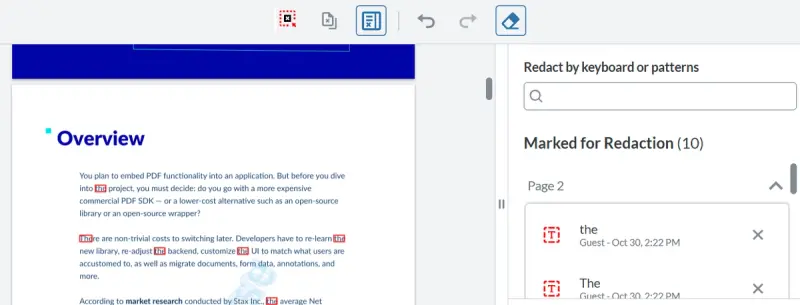
Figure 1 - An example of redaction - in this case all of the instances of the word "the" has been marked for redaction - but the redaction has not yet been applied. You might want to deselect the first word of the second paragraph, since in that case the word is "there", not "the" – the UI makes this easy to do.
The selected redactions are then applied – at which point the marked text, images, or annotations are removed and the file is permanently modified.
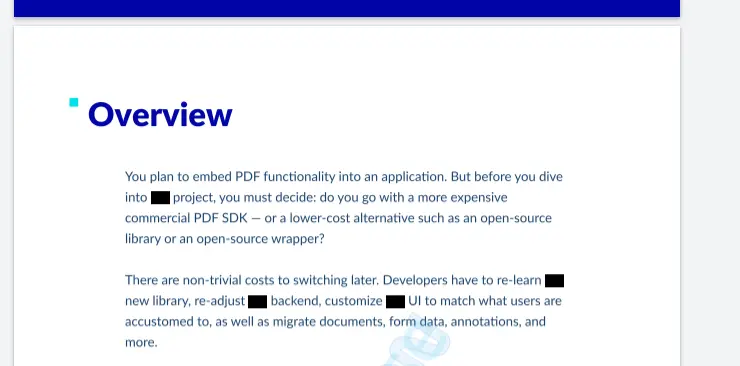
Figure 2 - The same document after the redaction has been applied - the words have not just been blacked out - they have also been removed from the underlying document.
Implementing a mechanism for counting Redaction Annotations
Regardless of whether you are using the legacy or Modular UI, the same underlying mechanism can be used for finding text that has been marked for redaction, but which has not yet been removed.
Marking the text creates a redaction annotation, and applying the redaction removes the annotation (and the underlying content). Therefore, you can tell if there are unapplied redactions simply by counting the number of redaction annotations that are present in the document.
Finding the redaction annotations is done by querying the Annotation Manager to get all the annotations in the document and then seeing which ones were created by the tool "AnnotationCreateRedaction".
Having counted the number of redaction annotations, an alert is displayed to the user.
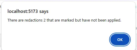
Figure 3 - The type of message that we will achieve using this tool.
You could use similar code to count other types of annotation – perhaps the number of comments, or the number of annotations created by a specific user.
Note: The Redaction functionality is not enabled by default and also requires the fullAPI. This means that if you want to follow along with this example you will need to specify the following when you initialize WebViewer.
fullAPI: true,
enableRedaction: true,
Choosing the style of the new button
There's lots of choice about how the button will look – you can choose either text and/or an image. You can also give it a dataElement property, and then use that to specify the style using CSS.
For this article we will use an image of a gecko (which is a type of lizard) simply so that it is easily identifiable – but you could use any of the built in icons or an image of your own. We will put that image into the src/public folder from where it can be accessed.
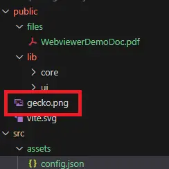
Figure 4- the location of the icon file that will be used for our button.
We will also define a tool tip – in this case “Count redactions” that will be displayed when the user hovers their mouse over the button.

Figure 5 - The button that we want to create, showing the icon and tooltip.
OK, we've said what the button should look like, and what it should do, but how do we actually add it to the UI?
Adding the button using the Legacy UI - Deprecated
If you are using version 10 of WebViewer, or else have chosen to use the Legacy UI in v 11, then you will need to add the button to the header using setHeaderItems.
The header will be a Toolbar Group (in this case called "toolbarGroup-Redact") and that will have a collection of items (relating to the default collection of buttons). We need to get that collection and splice a new object, in this case an Action Button into it.
One of the properties of the new button is the onClick handler, and this is where we specify the function that should be called. In this example we are using the function countRedactions that we defined earlier in this article.
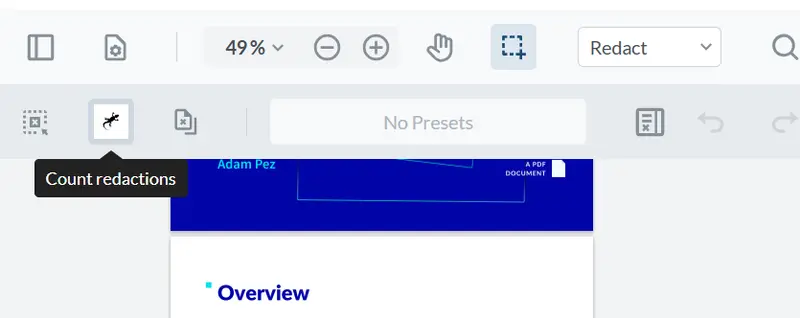
Figure 6 - A custom button within the legacy UI.
Rather than splicing the new object into the list, it could have been pushed onto the end, in which case it will appear at the extreme right-hand side of the tool bar.

Figure 7 - if you push the new button onto the list of controls in a toolbar group then it will end up at the extreme right of the toolbar.
Things to note:
- The new button is just created as an object with properties.
- The image is specified relative to the public folder ("/gecko.png")
- The index of the location where the new button should be spliced is apparently 1-indexed (so we use the value 2). In fact, this is an illusion since there is a hidden spacer element before the first visible button. There is a similar hidden spacer after the last button, which is the reason pushing the new button onto the end of the list of items results in it appearing at the extreme right.
Modular UI – Option 1 –adding the button using code
Step 1 – Define the button as a Custom Button
Rather than just having an untyped object, Modular UI lets us define the button as a specific "CustomButton", although the actual properties are similar.
Just as with the Legacy UI, we will specify the onClick handler to be the function countRedactions that we defined above.
Step 2 – Add the button to the "redactionGroupedItems" list
Toolbar Groups do not exist in the Modular UI, having been replaced with "Grouped Items".
In the previous example we looked for the "toolbarGroup-Redact" and added the new button there. The equivalent with the Modular UI is to find "redactionGroupedItems". We find that by getting the list of Grouped Items from the "tools-header" Modular Header, then searching the list for the redaction one.
Having found "redactionGroupedItems", we splice the button into its collection of items (though as before we could just push it onto the list).
If you reload the page, then the button will now be present – including a tooltip that shows when you hover over it. Exactly as we wanted, and when you click on it the alert is displayed.
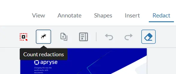
Figure 8- The custom button in the redaction tools.
Things to note
- The image is specified relative to the folder where the UI is running –, not relative to the public folder. As such the path to the file requires navigation to the public folder (using "../../gecko.png").
- When splicing the button into the list, it is zero-indexed (as expected) – since there is no hidden spacer element. Similarly, if you were to push the button onto the list it would appear immediately after the final visible button.
In this example we have just added a single button to the list in the Grouped Items object, which is a great first step. It is also possible to define exactly what tools are included in the list- check out how to specify all the tools in a Ribbon Group.
Modular UI – Option 2 - Adding a button via a UI config file
Rather than adding the new button programmatically, it can be added using a UI config file.
Step 1 – Get a UI config file to work with
The easiest way to get a UI config file is to download one of the prebuilt ones from the Apryse Showcase for Modular UI. Alternatively, you can export one using UI.exportModularComponents() and saving the resulting JSON file.
Step 2 - Add the new button to the UI config file
Next add the button definition to the JSON.
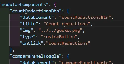
Figure 9 - A typical button definition in a UI config file.
Find the Grouped Items object (which was mentioned earlier) where the new button should be located, and add the name of the new button wherever you’d like it positioned into its array of “items”.
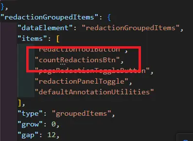
Figure 10 - Adding the new button to a Grouped Items object. It could be added to more than one if you require.
Step 3 - Import the UI config file
At this point, if you import the UI config file, the button will appear, but nothing will happen when you click on it. This is because the UI config file does not contain the implementation of the function for the button click event.
It is therefore necessary to define a function map to provide a link between the name of the function, which is included in the UI config file, and that actual implementation code.
Since we have already defined a function to do the processing, our function map can be as simple as just specifying the function name (although you could put the actual implementation code into the function map if you prefer).
The UI config is then imported using UI.importModularComponents(config, functionMap);
Now the button will appear in the UI, and clicking on it will run the function.
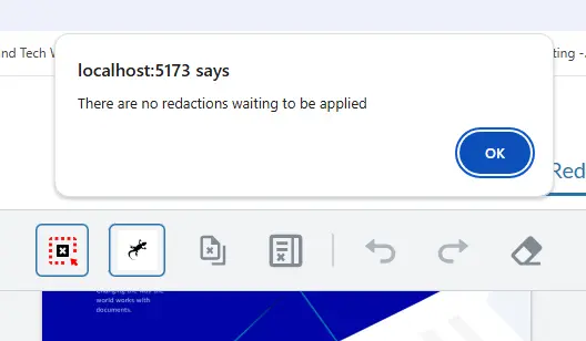
Figure 11 - An example of the working tool. In this case there are no un-applied redactions.
Things to note
- The config file contains the entire UI definition. This makes it verbose but avoids the need to work out the index where the button should be inserted.
- Using a UI config file allows the UI to be rapidly changed for different scenarios – for example, you can have a different UI config file for each user, or for different screen resolutions.
- The path to the image file is relative to the location where the WebViewer UI is running (this is the same behavior that was seen with the other Modular UI option)
- Functions cannot be defined in the config file – a function map is therefore needed.
Troubleshooting
If you use one of the Modular methods, but also specify ui:”legacy” then the custom button will not appear. Similarly, no button will be visible if you use the legacy method but don't specify ui:”legacy”.
Wrapping up
WebViewer offers multiple ways in which you can configure the UI. Modular UI is now the default, which is a breaking change between v10, and v11.
We don't take breaking changes lightly, but we feel that the new Modular UI is a step–change improvement in ease of UI configuration and allows your apps to be WCGA2.1 AA compliant, improving accessibility for all users.
If, however, you want to continue using the v10-style UI then you can do so by specifying ui:”legacy” in the WebViewer constructor.
If you run into any problems, or have any questions, please feel free to contact us via our Discord channel.
