Roger Dunham
Published October 01, 2025
Updated February 02, 2026
Top 5 things you need to know about updating your UI to WCAG-compliance
Roger Dunham
Summary: Not only is accessibility important for reaching millions more users, it's also required by law in many jurisdictions. By applying these simple tips to update your UI, you can ensure compliance with WCAG guidelines and enhance the accessibility of your UI.
Introduction
Accessibility of Web Applications matters – not only because making websites accessible to people with disabilities is inclusive, but also because, quite simply, it is good for business. Website Accessibility is a current, or imminent, legal requirement in many countries (for example the European Accessibility Act - which came into force in the EU in June 2025 - as well as Section 508 of the Rehabilitation Act in the US).
There are other benefits too - having a well laid out, accessible UI is easier for SEO analysis, which might improve your website ranking in Search Engine results.
That sounds like a huge win for both you and your customers.
In this article we will look at the top five things you need to know to comply with the WCAG (Web Content Accessibility Guidelines) 2.1 standard and we use Apryse WebViewer v11, with the Modular UI, as an example of a compliant application.
Apryse WebViewer v11.6 not only meets these requirements, but also the more stringent WCGA 2.2 AA standard.
What are the WCAG 2.1 Guidelines?
WCAG 2.1 was initiated in 2018, and updated in 2023, with the goal of improving accessibility for three major groups:
- users with cognitive or learning disabilities,
- users with low vision, and
- users with disabilities on mobile devices
The principles of WCAG 2.1 can be summarized using the acronym “POUR” as follows
Perceivable: Information and UI components must be presented in ways that users can perceive (e.g., with text alternatives, captions, color contrast).
Operable: Interface components and navigation must be usable by everyone, including those who rely on assistive technologies (e.g., keyboard navigation, enough time for tasks).
Understandable: Information and operation of the interface must be clear and predictable (e.g., clear language, consistent navigation).
Robust: Content must be reliable across various user agents, including assistive technologies, so it remains accessible as technologies evolve.
It’s worth also mentioning that there are three levels of conformance
Level A (minimum level) – Essential accessibility.
Level AA (medium level) – Addresses the most common accessibility barriers (this is the level that WebViewer complies with).
Level AAA (highest level) – The most inclusive and strictest criteria, but often difficult to achieve for all web content
Apryse WebViewer is now WCAG 2.1 Level AA compliant. In this article we will use WebViewer as an example of good practice when resolving the five major issues that need to be addressed when creating a compliant UI.
Issue 1: Color Contrast and Readability
The ability to read something on a webpage depends both on the size of the text and the contrast between the color of the text and its background (known as the “contrast ratio”).
Contrast ratio, ranges from 1:1 (no difference) to 21:1 (extremely different) and is based on relative luminance.

Figure 1 - Yellow text on a white background has a contrast of 1.07 and is very hard to read.

Figure 2 – Red brown text on light blue is much easier to read with a contrast of 11.0.
Calculating the number is a little complex (for example, it considers that humans are more sensitive to green than to red or blue) but you could write a calculator with a few lines of code based on the definitions provided by W3C.
Alternatively, you could use one of the prebuilt online tools to find the contrast ratio for a pair of colors.
WCAG 2.1 AA requires a contrast ratio of at least 4.5:1 for normal text and 3:1 for large text (14pt and above). These ratios increase for the stricter AAA conformance level to at least 7:1 for normal text and 4.5:1 for large text.

Figure 3 – An example of good contrast while maintaining a good appearance.
Issue 2: Keyboard Accessibility
I’m a great fan of using the mouse, but not everyone can, or indeed wants to. As such it is essential that those people that rely on keyboards should still be able to reach all of the web application’s functionality. Furthermore, in addition to being able to access it, the way to do so should be intuitive.
Sounds easy? In reality it can be hard to get this right.
As an example, let’s look at the Save As modal dialog within WebViewer.
In both versions 10, and 11 it is easy to open and close that dialog if you use a mouse.
It is also easy to open the dialog using Tab, Arrow and Enter keys (I use a Windows PC).
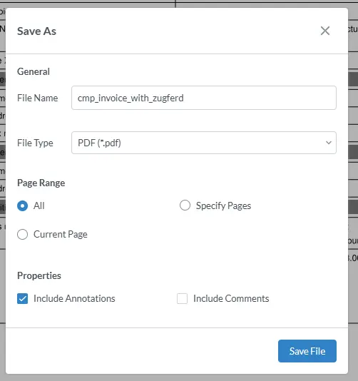
Figure 4 - The SaveAs modal dialog in WebViewer.
If I want to cancel out of the dialog then I can use Esc, and that behaves entirely as expected. Everything is perfect so far.
However, in v10, it is then unclear how to reopen the dialog, since it is not obvious where the Tab focus has moved to.

Figure 5 - In earlier versions of WebViewer, cancelling a modal dialog resulted in it being unclear what to do next. This is fixed in v11.
In fact, it’s necessary to press Tab about five times to get back to the main menu that gives access to reopening the dialog – which is a very poor user experience.
In WebViewer 11 this has been resolved. Cancelling the modal dialog now takes you back to the menu from which it was opened, so if you need to reopen it, you only need to press one key on the keyboard.
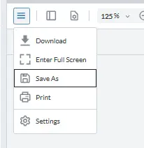
Figure 4 - Pressing Esc will close the modal dialog and take you back to the location where you were before the dialog opened, in this case the Save As menu item
That’s a huge improvement for any user with accessibility issues.
Issue 3: Providing Alternative Text
They say that a picture paints a thousand words, and it certainly seems that way.
Within UIs, icons are often used to indicate what a particular button does. Similarly, articles, such as this one, use images to illustrate an idea.
For users with low vision, there are some great screen reader apps that can help with text, but how are they supposed to handle things that are not text?
Let’s look at an example – the button that adds a rectangular annotation in WebViewer. It has an icon, which works well for those with good vision – it even has a high contrast ratio. There is also a title displayed when the tool is selected, which is useful for sighted users, of course, but it can also be used by a screen reader to say what the button does, making the UI accessible to users with limited vision.

Figure 7 – The use of a title makes it clear what the button does.
Issue 4: Have a Clear and Consistent Layout
In the case of an article, having a clear, logical, structure with headings, and a consistent layout (as well as alt-text for images) makes it easier to understand the content.
This is perhaps less relevant when developing a UI, although having a coherent set of top menu items, each containing appropriate subitems, is clearly better than having dozens of separate buttons and menu items all visible at the same time.
Regardless of how you configure the UI, it is essential that it is logical to navigate with the keyboard. You can imagine how difficult it would be to understand a magazine if the content reading order was chaotic.
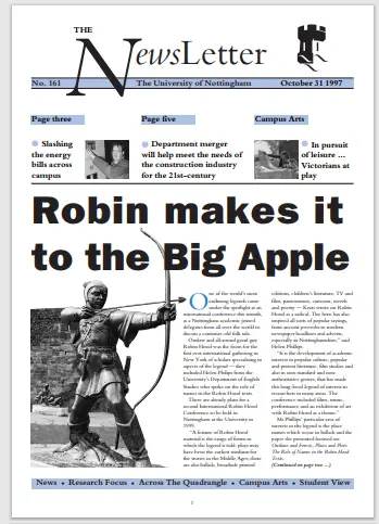
Figure 8 – Logical layout matters – if the UI took you all over the place like this then it would be very hard to understand.
Getting it wrong in a document is usually obvious, but it is easy to develop a UI with chaotic navigation.
WebViewer comes with a well thought out UI which is helped further by making it clear which button is selected.

Figure 9 - The use of a border makes it clear which of these buttons is selected.
If, however, the default UI for WebViewer doesn’t match your requirements then it is easy to reconfigure it using Modular UI Config files.
Issue 5: Accessible Forms and Error Feedback
Good accessibility requires that any input fields are easy to understand - with clear instructions, and some way of telling the user what went wrong if something is incorrect.
A great example of this is the Multi-select text box in the thumbnail pane of WebViewer. The text box is there to allow you to quickly choose a set of pages that should be rotated, deleted, extracted or replaced.
In the WebViewer v10 this text box included placeholder text that indicated the format that should be used to specify the selection.
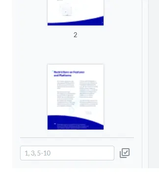
Figure 10 - The Multi-select text box in WebViewer 10 - the placeholder text shows the required format of what should be entered.
The problem with this is that as soon as the user starts to enter text, the placeholder disappears, leaving them wondering whether to use commas, semicolons, or dashes – exactly when they need to know!

Figure 11 - in WebViewer 10, as soon as the user starts to enter text, the placeholder disappears, taking away the instructions of how to use the text box. This is fixed in v11.
In version 11 of WebViewer there is a subtle change, with the addition of a label that describes what the box does, and also an example of how to enter the selection. Both stay visible even when text is entered.

Figure 12 - In WebViewer v11 you can still see the correct format, even when you have started to enter text.
Now if you want to use a range, you can see the syntax, rather than having to guess. That will save users time and frustration, particularly for those who are not familiar with the software.
There is even a warning, and explanation, displayed if the user makes a mistake (this was also present in v10), although it is only visible within the DevTools pane (typically shown on a desktop PC by pressing F12).
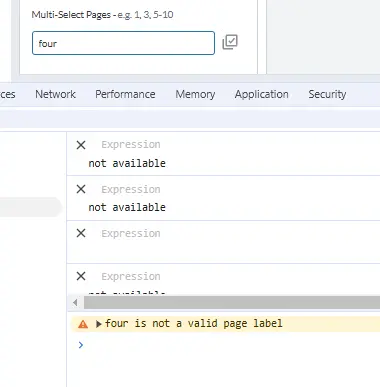
Figure 13 - If you enter an invalid value, then a warning is displayed in the DevTools pane to help you to solve the problem.
Wrapping up
WCAG compliance is important for legal, business and ethical reasons. WebViewer v11 is already WCAG 2.2 AA compliant, making it ideal for using within your website – essential if you are providing services to Government or are public facing within the EU.
WebViewer does much more than just allowing users to read documents though. It also offers a way for them to edit, apply annotations, measure things, work collaboratively, and provides access to a host of other document processing functionality via the underlying Apryse SDK.
Check out the documentation, get yourself a free trial license, and if you have any questions, please reach out to us on our Discord channel.
[This article was originally published in November 2024]

