Roger Dunham
Published October 23, 2024
Updated May 18, 2026
4 min
Using the Import/Export mechanism for the Modular UI
Roger Dunham
Summary: In June 2024, we launched Modular UI for WebViewer, boosting accessibility to WCAG 2.1 compliance and simplifying UI customization. It became the default UI with WebViewer 11 in October, allowing dynamic, user-specific interfaces through JSON config files—offering a tailored experience that adapts to each user's needs.
Introduction
Back in June 2024, we released the Modular UI for WebViewer. There were two reasons for this.
- It helps to enhance accessibility of WebViewer to a level that is WCAG 2.1 compliant. That was necessary to meet the requirements of the European Accessibility Act (which will affect many digital products and services operating in the European Union from June 2025).
- It creates a simplified mechanism for customizing the WebViewer UI .
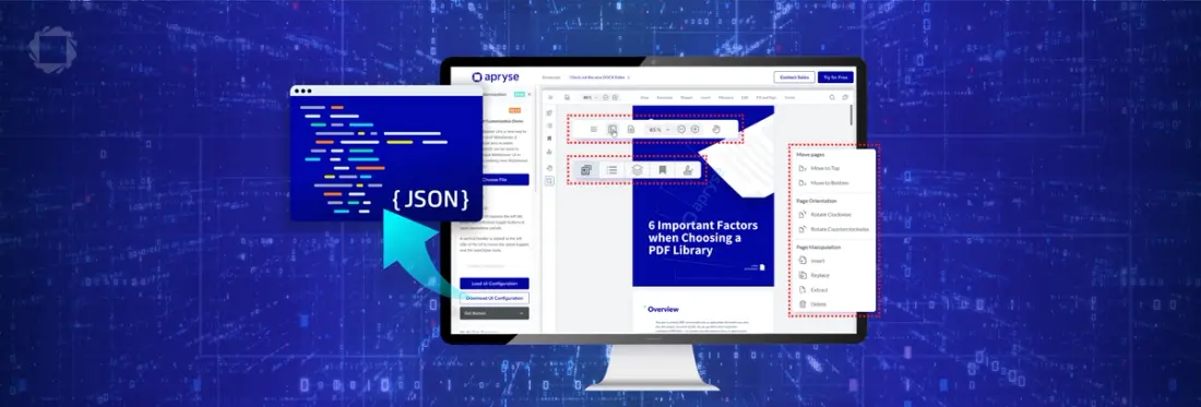
While initially released as an option (selected by using ui:”beta”), Modular UI became the default UI from WebViewer version 11, released at the end of October.
In this article we will look at how you can use JSON based config files to quickly implement a custom UI. In fact, if you have multiple config files available then you can use this mechanism to modify the UI depending on which person is using the software - just change which config file is loaded - and we will see how to do that.
A word about versions
This article was written using WebViewer 11.0 running on Windows 11. Since WebViewer is being actively developed, the details of how things work may change over time. If you have any questions, then please contact us via our Discord channel.
What is WebViewer?
WebViewer is a fully featured JavaScript based document processing SDK with an open-source UI. It can be used as vanilla JavaScript and HTML, or it can be used with many frameworks including Vue and React.
It’s easy to get started with - if you like written instructions, then head over to our guide on getting started with WebViewer and React. Alternatively, if you prefer videos then check out Creating a PDF Viewer using React, Vite and TypeScript.
Getting a config file
A great way to understand the JSON based config files is to export one from WebViewer that includes the values that it uses by default. That’s easy to do using exportModularComponents().
This will write the Modular Components as JSON to the browser’s console (which you can access from DevTools - typically F12 for Chrome).
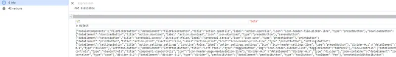
Figure 1 - Part of the JSON exported from WebViewer, shown in the console window of Chrome.
Copy that text and drop it into a text editor (I’m using Notepad++ with the JSON Viewer plug-in, which allows me to format the JSON).
You can now see its general layout.
The structure of the JSON is fairly intuitive. Have a scroll through the file, and you can see that it is made up of four sections - modularComponents, modularHeaders, panels and flyouts.
Read more about the Structure of the Modular UI
Rather than exporting the default config file, you could get one from the WebViewer Showcase for Modular UI, where there are a couple of examples available.
Importing a Config file
In a moment we will import the config file back into WebViewer using UI.importModularComponents(). When we do that the UI will be updated.
import config from '[Path to json file]';
….
UI.importModularComponents(config, functionMap);
There are two things to notice here:
- There’s an optional functionMap object - which we will talk about later in this article.
- You need to pass the imported JSON object into the function - not the path to the file that contains the JSON. If you pass in the path, then you will get an obscure “Cannot read properties of null (reading 'getBoundingClientRect')” error.
You could import the default config - but that wouldn’t be very interesting as you would just get the same UI - so let’s see about making some changes.
Removing a Component from the UI
Let’s remove a modular component from the UI and reimport the config file. As an example, let’s remove the SaveAs button, that is located in the main “hamburger” menu.
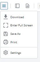
Figure 3 - By default, “Save As” is shown in the main menu.
Menus are termed “flyouts” in the modular UI - so find that section in the JSON file.
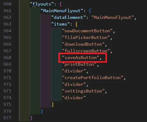
Figure 4 - Part of the JSON file, showing the items that will be in the main menu.
In order to be shown in the UI, the saveAsButton needs to be included in the list of items for the MainMenuFlyout, so if we delete the element from that list, save the config file then reimport it using UI.importModularComponents() the SaveAs button will no longer be present.
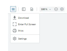
Figure 5 - Having removed “saveAsButton” from the flyout’s array of items, “Save As” is no longer shown.
You might have noticed that the flyout’s list of items still contains 7 buttons, including newDocumentButton, filePickerButton and createPortfolioButton - but they aren’t shown. That’s because those elements, while potentially visible, will only be shown if they are both in the config file and also enabled within WebViewer. Those three buttons are not enabled by default (nor were they in earlier versions of WebViewer) and need to be explicitly enabled.
For example, we can show the FilePicker button by specifying:
instance.UI.enableFeatures([instance.UI.Feature.FilePicker]);(Alternatively, you can specify enableFilePicker: true in the WebViewer constructor.)
When WebViewer reloads, the menu item will be there.
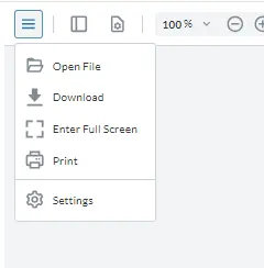
Figure 6 - Some menu items relate to features that need to be enabled in order for them to be visible.
That might sound confusing, but it is exactly the same behavior as was previously available. It also means that you can create a single config file which can be used whether or not the FilePicker, or Portfolio button are needed, rather than needing separate ones for each scenario.
What about changing the order of things?
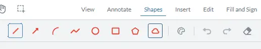
It’s easy to change the order of things in the UI - just change the order that they are specified in the JSON file. As an example, let’s look at the Shapes Ribbon group.
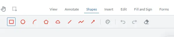
Figure 7- The collection of Shapes tools.
As we previously saw, the items in this group “toolbarGroup-Shapes” are controlled by the config file. If you find the place in the file you will see that there is an array of groupedItems.
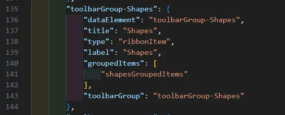
Figure 8 - The part of the JSON file where the toolbarGroup-Shapes is defined.
In this case there is only one groupedItem - shapesGroupedItems. If we look at that object, we can see that it, too, has a collection of items:
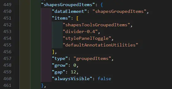
Figure 9 - The part of the JSON file where the shapesGroupedItems are defined.
In this case there are four items. The first shapesToolsGroupedItems (which we will get to in a minute) is, itself, a collection of items.
There is also a divider, then a toggle button which shows or hides the style panel, and finally a collection of default utilities. The default utilities are used in several groups which is great - it’s only necessary to define that collection (which consists of undo, redo and the eraser tools) in one place, and then it can be used in multiple ribbons.
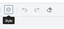
Figure 10 - the Style button, and the Annotation Utilities collection which are reused in several ribbons.
The shapesToolsGroupedItems has a list of eight different tools.
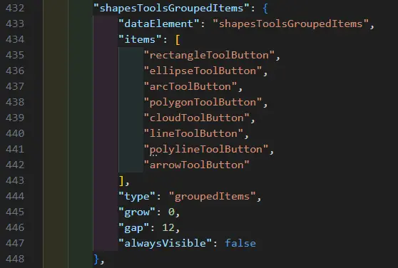
Figure 11- The shapesToolsGroupedItems, showing the eight tools within it.
Finally, we have reached the list that we need to modify. We can remove any of these tools (as we did with the SaveAs button), add new buttons (or even add the same tool again to get multiple instances of the tool as was the case in the legacy UI.), or we can change the order in which the buttons are displayed.
As an example, we will change the order so that lineToolButton is first, then arrowToolButton and so on.
Save the config file and reload the page and you will see that the order of buttons has changed - just as we specified.
Changing the icon of a button
Let’s change the icon associated with the polygon button to be an image of a duck (for no specific reason - I just like ducks).
My duck image is called “small-duck.svg”, so I’ll drop that into src/assets folder.
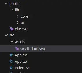
Figure 12 - Locating an image file to be used as an icon.
Next, add an “img” (not “icon”) attribute to the button and specify the path to the image.
It can be a little tricky working out the correct path. It needs to be relative to the folder from which WebViewer is running (typically public/lib). If you run into issues, then the network tab in DevTools will show whether or not the file was found at the location that it calculated based on your relative path.
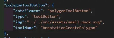
Figure 13 - Specifying the relative path to an image file to be used as an icon for the button.
Once the path is correct, you can see that the image associated with the button has changed.
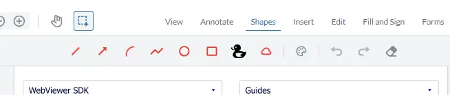
Figure 14 - The Polygon tool now has a modified icon.
While you can use a custom image as an icon, as we have seen, you can also use one of the many icons built into WebViewer.
As an example, let’s use the calibrate icon, instead of our duck image.
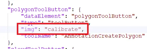
Figure 15- An example of using a prebuilt icon.
Reload the page and we can see the new icon - better still you can even see how it’s color can be updated using the Style button.
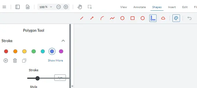
Figure 16 - The Polygon button now uses the custom Calibrate icon that was specified.
In a future article we will look at how to make custom icons that reflect the style that the tool will use.
Adding a custom button
Next, we will add a custom button to WebViewer. There are lots of reasons why you might want to - we'll look at a few in a minute.
In this case we will add a button that will open a dialog containing the name of the current user.
To start with, add the button definition to the config file. Next add the button name to the default annotation utilities which we saw earlier (that was the group that contained the undo, redo and the eraser tools). Adding the button in that way will make it available to several different ribbons that were already using that group.
At this point, if we reload WebViewer then the new button is visible - it even has a tool tip (which we specified using “title”) - but it doesn’t do anything since we haven’t defined that yet.
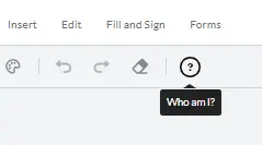
Figure 17- A custom button with a tool tip.
Next, let’s specify the onClick handler “whoAmIButtonClick”.
There is a problem though - we can’t store the event handler code in the JSON file - that needs to be specified in the App.jsx (or another JavaScript) file.
The solution is easy - we use a Function Map.
Function Maps
A function map is a block of code that includes the event handlers that are needed by the config file. In this case when 'whoAmIButtonClick' is called an alert will be shown.
Now import the custom UI, passing in both the JSON config and the functionMap.
UI.importModularComponents(config, functionMap);Under the hood, this gets linked together with no extra effort from us.
When the page reloads, and the user clicks on the “Who Am I” button an alert will be displayed containing the current Annotation user.
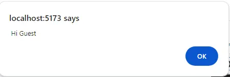
Figure 18- A message shown by our custom button.
In case you are wondering why it just says Guest, it’s because that is the default name if nothing else has been set. If we had previously called annotationManager.setUser(“Dave”) then the dialog would now say “Hi Dave”
Read more about how you can control what users can do with annotations based on who they are.
This mechanism isn’t restricted to creating alerts, or course. You could use the button to generate a new document, or automatically apply redactions based on a set of rules, or digitally sign a document, or implement any of the huge range of functionality that WebViewer supports.
Wrapping Up
We’ve seen how we can export the configuration for the default Modular UI as a JSON file, and how we can modify that file, then reimport it to quickly customize WebViewer. We’ve also seen how we can add new custom buttons and wire them up to work with their event handlers.
WebViewer is much more than just a customizable PDF Viewer though; with its ability to work with a wide range of document types, including the ability to create and edit DOCX files natively within the browser, it could be the only tool needed to implement entire workflows.
Don’t just take my word for it. Try things out for yourself at the Apryse Showcase, or better still get yourself a free trial license key, and start using WebViewer.
There is a wealth of documentation available, dozens of blog articles and if you have any questions then reach out to us on our Discord channel.


