Customize the UI in Android Document Collaboration App
By Branden Fung | 2019 May 01

In a separate blog post, we created a real-time document collaboration app using Firebase and PDFTron's Android PDF SDK. This lets many users view the same document at the same time and communicate via comments, highlights, signatures, and other annotations.
In this article, we cover how to customize the collaboration app UI to match your desired look, and also dive into some advanced interface customization using PDFTron's open-source UI components.
You can find the code referenced in this article in our GitHub repository.
Change the Color Theme
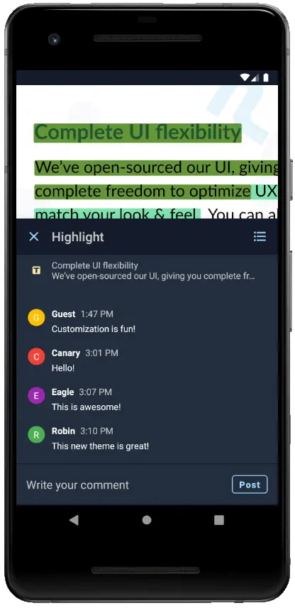
By default, the annotation reply UI in the PDFTron library uses PDFTron's standard app styles, which could clash with the look of your app if it has a completely different theme.
With Native Android’s powerful styling and theming capabilities, however, developers can easily customize the appearance of their apps using style XML resource files. PDFTron’s Android PDF SDK leverages this capability to provide Android developers with a familiar and easy way to style PDFTron’s document viewer components.
The following steps will demonstrate how to create a unique dark-colored theme for our Firebase sample app.
Step 1. Define Custom Colors
Define some custom colors in res/colors.xml. These colors will be used by both the document viewer and the reply UI.
Step 2. Create a Custom Style
Create a new style that extends ReplyBaseTheme.DayNight in res/styles.xml, and specify the attributes in ReplyBaseTheme.DayNight that you want to customize.
Step 3. Specify the Custom Style in Your Activity's Theme
Finally, add the custom reply UI style to your activity by defining the replyTheme attribute in your activity's theme.
The app should now look something like this:
Customize the UI Layout
The new color palette for our sample app looks great, but we can take things even further by changing the viewer layout directly. The UI components in PDFTron's Android PDF SDK are fully open-source, making it easy to reference and modify UI components.
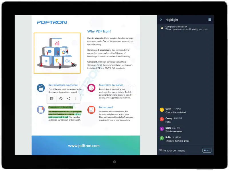
Let’s make a custom viewer layout for tablet devices that makes use of the extra space on tablet screens to display our reply UI.
Step 1. Create a New Layout XML
Define a new layout XML file that we'll use for our custom viewer fragment. It'll simply add a container for our reply UI next to our document viewer.
Step 2. Create a Custom Viewer Fragment
Create a new Fragment class and extend CollabViewerTabFragment. In this new class, we'll override the following methods in order to tell the viewer to use our custom layout from step 1, and where the reply UI components will be inflated.
Step 3. Use the Custom Viewer
We can then create the viewer Fragment by specifying the custom class in the Fragment builder, and use it like any other Android Fragment:
Using this custom viewer on landscape-oriented tablet devices, the annotation reply UI is now displayed alongside the document viewer.
Conclusion
The real-time collaboration library from PDFTron's Android SDK brings a new collaborative document viewing experience to Android, making use of PDFTron's powerful document viewing and editing features. Combining this new library with the flexibility of PDFTron's UI components allows developers to easily create beautiful custom apps with full-featured document viewing capabilities.
If you have any questions about PDFTron's Android PDF SDK, please feel free to get in touch!
The complete source code for the sample app in this blog post series is available at our GitHub repository.

Branden Fung
Share this post