Valerie Yates
Sr. Content Strategist
Published February 16, 2022
Updated March 03, 2026
6 min
Comparing PDF and Word Documents with Semantic Comparison
Valerie Yates
Sr. Content Strategist
Related Products
Semantic Text Compare

Your users need a reliable and intuitive tool to compare PDF and Word documents, many of them complex and sizable. Your solution to review and compare a large number of PDF files therefore needs to be easy to use yet sophisticated enough to allow customization and comparison programmatically.
However, adding custom, intuitive document comparison to an existing application, especially a web app, isn't easy. Few ready-to-go components are available on the market, and a cloud-based service solution isn't the answer if you want to own the workflow end to end. Bootstrapping a solution from open source software takes lots of time and resources to integrate, test, and deploy, and the result will be difficult to support and maintain in-house.
In this blog, we introduce a reliable, ready-made solution by Apryse – semantic text comparison. We then compare it vs. basic character comparison that developers typically start with. (No pun intended!)
You can try out this new feature in your project today, in a web application or any other application. Semantic Comparison was introduced in our cross-platform Apryse SDK 9.2 release and is available within WebViewer, our comprehensive JavaScript SDK for adding features to any web application.
Try the Semantic Comparison demo to see features in your browser. And dive deeper with our Semantic Comparison guide for more details and samples for our core SDK.
Word document comparison isn't available directly, but since it is a snip to convert Word documents to PDFs (using loadAsPDF within WebViewer), this provides an easy route to compare DOCX with PDFs or other DOCX files.
Now, let’s look at how it works.
What Is Semantic Text Comparison?
Character by character is a mainstay of document comparison technology enabled via a text extraction API, such as the one in the Apryse SDK and other native, commercial alternatives. It’s functionality we’ve also supported for many years in our WebViewer client-side SDK and APIs for viewing, annotating and editing documents.
Character by character was previously the foundation on which teams had to construct custom, in-house comparison solutions, that is, before semantic text comparison.
You can see from our character comparison demo (screenshot beneath) that the user experience with character by character was adequate for some applications.

A raw text extraction from two related documents compared character by character
But going from here to totally intuitive comparisons, with differences captured in related pairs as users expect, is significantly challenging; the vast majority of PDF documents do not contain logical structure and relationships baked into the file. As a result, it is difficult to assemble intuitive comparisons that capture differences in human reading order rather than in machine order. Teams can only reconstruct meaningful results via a lot of trial and error and file format analysis using document understanding methods – a whole field of document software specialization.
Wanting to build a truly intuitive comparison experience, we recently developed the new Semantic Comparison feature that would provide this experience out of the box.
How Apryse Enables Intuitive PDF and Word Document Comparison
Below you can see the “Before” version of a document on the left (red highlights) and the “After” version on the right (green highlights) using our new Semantic Comparison component.
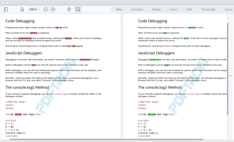
Before and after, side by side with Apryse Semantic Comparison
In contrast, the new Semantic Comparison component displays two versions of a PDF in the viewer, highlighting the textual differences side by side, along with a summary of differences for easy review.
As a result, highlights appear in a way that is intuitive to human readers, who no longer have to piece together characters into words.
The tool also handles deletions in an obvious way, so users don’t have to check against the original version to detect omissions, making changes easy to find. And it automatically compensates for offsets such as paragraph, line, and page changes, which ensures that developer teams no longer need to invest significant time into reinventing the wheel to prevent whole passages or pages from showing up red.
Features for a Complete Comparison Workflow
To further streamline integration, Apryse’s Semantic Comparison comes with additional features to support a variety of use cases.
For example, users can compare document versions side by side or in a single page view mode, and toggle between page view modes in the UI out of the box.
Paired highlights provide useful additional information on what type of change a difference is. These annotations show whether a difference is a deletion, insertion, or an edit. Highlights capture all changes, even in complex documents and even when a change spans two pages, or when an entire page is deleted.
A Closer Look at Paired Highlights
Paired highlights indicate specific changes, such as deletions, insertions, and edits, in that order.

In this example, text is deleted (red highlight) from the Before side. A corresponding highlight (green) is inserted into the After side to indicate where the text was deleted.

Text is inserted into the After side (green). A corresponding highlight (red) displays in the Before side to show you where the text was inserted.

When content is edited, such as a numeral in a date, the difference comes out as a pair of annotations consisting of a deletion on the Before side and an insertion on the After side.

When entire blocks of content are inserted or deleted, the highlight displays as a horizontal line. In the example above, the deleted content is highlighted in red in the Before document and the deletion in the After document is indicated by a green line. This way, users won’t miss a deletion during review.
Easy to Track Changes
Next, not only are highlighted changes easy to understand – you can track each and every change throughout the review workflow so that individual changes never slip through the cracks.
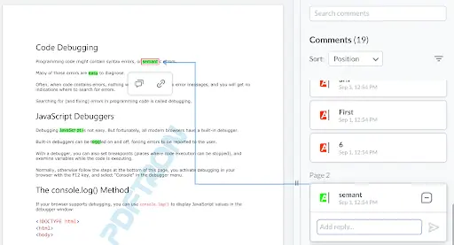
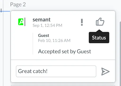
Intuitive commenting lets users track each and every change throughout the review process
Users can search for and sort highlights, comment on specific highlights, add replies, link URLs and pages to highlights, and set or change the status of specific highlights to drive a review and approval process forward.
Backed by the Leading Document SDK and APIs
Comparison is part of our full SDK, which provides a complete toolkit of document processing components to build out a professional workflow. Semantic Comparison is also backed by Apryse SDK rendering for industry-leading performance, accuracy, and stability, so highlights appear quickly and as expected on documents as long as 1,000+ pages, or 1GB+ in file size, even in a mobile browser.
Lastly, the solution is fully customizable to suit your desired workflow and look and feel. To help you along the way, we provide UI source code in React, deep customization APIs, and plenty of customization guides.
Wrap Up
We will continue to develop semantic text comparison in the months and weeks ahead to bring you a best-in-class developer and end-user experience, on every platform.
If you have any questions, a feature request, or suggestions, don't hesitate to contact one of our product specialists. We’d be delighted to discuss any of your additional requirements, answer questions, or respond to feedback. Just drop us a line.
[This document was updated in March 2024]
