Roger Dunham
Published December 18, 2024
Updated December 18, 2024
4 min
Creating custom icons for tools in WebViewer
Roger Dunham
Summary: Explore the process of designing custom icons for Tool buttons in the WebViewer’s Modular UI. This guide simplifies UI customization while ensuring WCGA2.1 AA compliance.
Introduction
The Apryse WebViewer is a fully functional PDF and DOCX viewer and editor, that runs in the browser with no external dependencies. It also has an extremely customizable UI.
While you could fork and edit the UI, in many situations there is no need for extensive coding work. With the introduction of the Modular UI, WebViewer is both accessible (the default UI is WCGA2.1 AA compliant), and easy to customize via configuration.
In this article we will look at how to create a custom icon for the built-in Tool buttons. We will also see how, with some simple steps, you can get the icon to update to reflect the styling that the tool uses.
Getting Started
For this article, I’m going to assume that you are using React, scaffolded with Vite. If, however, you prefer Vue, Angular, or vanilla JavaScript (or several other frameworks) then WebViewer also works with those, too.
If you are not familiar with WebViewer then I suggest trying out one of the many getting started with WebViewer samples.
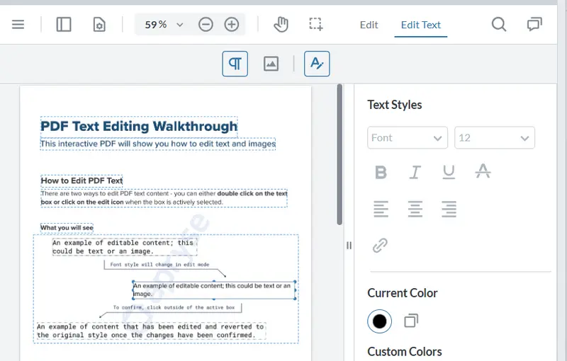
Figure 1 - A typical example of WebViewer displaying a PDF within the browser, in this case from showcase.apryse.com.
What are Tool Buttons?
WebViewer ships with a set of Tool buttons that can be used to perform a wide range of functionality, from drawing arcs to striking out text, to marking redactions, and more.
Within WebViewer 11, these are typically arranged by grouping similar functionality into lists known as “Grouped Items”. An example of this is the collection of Shapes tools.

Figure 2 - The Shapes tools showing the default buttons.
Many of these tools are used to draw on, or otherwise annotate the PDF that is being edited, and often you can change the color that is used for that operation.
One of the cool things about WebViewer’s Modular UI is that, typically, when you can change the tool color, that color is also used to update the associated button icon.
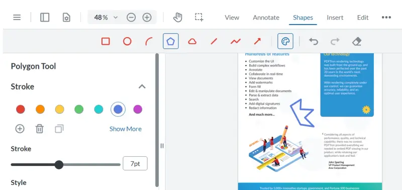
Figure 3 - If you change the color that the tool will user then the icon will update to reflect that color. In this case the polyline tool has been set to blue.
Changing the Icon to One of the Built-in Ones
WebViewer ships with great icons, but you might decide that you want to use a different one – perhaps the default icon already means something else in a different application used in your organization, and having the same icon used for two different things might cause confusion.
Modular UI makes it easy to change icons – allowing you to define the image that is used for a particular button.
The easiest way to change the icon is by using one of the many that ship with the WebViewer UI. You can get the list of these from https://github.com/ApryseSDK/webviewer-ui/tree/11.0/assets/icons
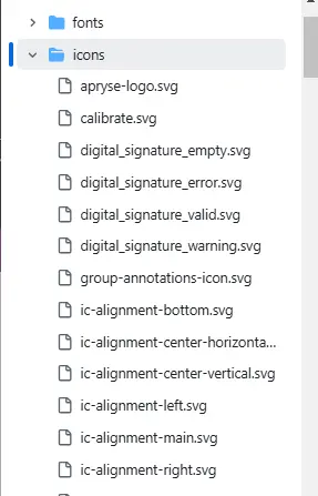
Figure 4 - A few if the icons that sip with WebViewer UI
As an example, we will change the icon used for the “cloud” tool to use the “Calibrate” icon (for no better reason than it is at the top of the list!).
In WebViewer 10 this would have needed to be done programmatically (and we will see that you still can later in this article). However, in v11, it is now also possible to use a JSON config file.
Using UI config files offers enormous, but simple, flexibility. You could, for example, have multiple config files and use these to update the UI depending on which user is working with WebViewer (Potentially as the next step of Role Based Access Control).
Learn more about UI Customization using the Apryse Showcase.
For now, though we will just use the default config file (which you can create by using exportModularComponents().
To update the icon, you just need to add an “img” key and specify the name of the icon (in this case “Calibrate”.
Next, import the config file so that it is used to overwrite the default UI. This is done using importModularComponents().
import config from './assets/config.json';
//other code
instance.UI.importModularComponents(config);
Now, if we reload webpage, the button’s appearance will have changed, to be that of the icon from the library.

Figure 5 - By changing the config file to specify "img" the button icon can be changed. In this case the Cloud tool has been updated to use the calibrate icon.
That’s already great, but better still is that if you change the style of the tool to be green, then the icon also updates. Now you know what will happen If you use that tool.
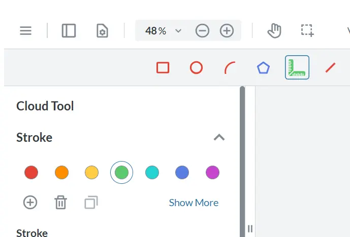
Figure 6 - When you specify the color that the tool (in this case the Cloud tool) will use, the icon also updates.
That’s awesome! But what if you want to use your own file?
Specifying a New Icon Using Inline SVG
Rather than using one of the existing icons in the library, it is also possible to specify a custom icon by referencing an SVG file.
As an example, we will use the (slightly) modified content of the “react.svg” logo file which is often created when you scaffold a project. (The required modification involves escaping the double quotes so that they are valid in JSON and also removing the fill color - which is "#00D8FF" in the original file).

Figure 7 - An example of how to specify an image in the config file using SVG.
If you save the config file and refresh WebViewer then the icon will update, and its color will change when you alter the tool style.
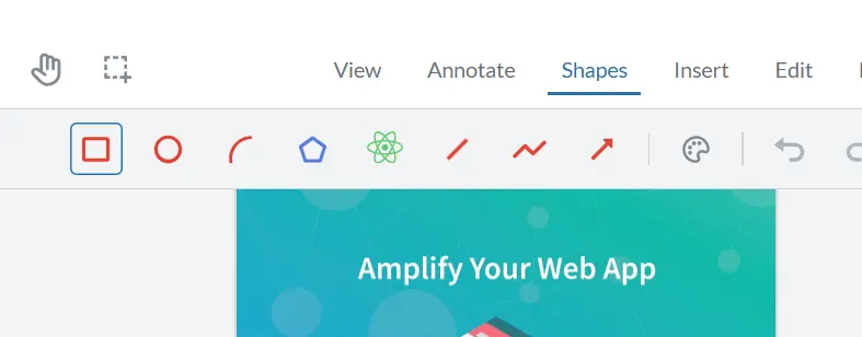
Figure 8 - The cloud tool now uses the React logo, and the color of the logo will update to reflect the color that the tool uses.
Specifying a New Icon as an External File
Rather than using inline SVG, it is also possible to specify a path to an external file that contains the icon. There are multiple image types that can be used for the icon (e.g. PNG) but for now we will use an SVG file again.
As an example, I’ve copied the SVG that we just used inline into the file react.svg. Now it is just necessary to specify the path to that file.
It’s a little gnarly to work out the correct path, since it needs to be relative to where the code is running, which is typically in the UI folder where you copied the WebViewer files.
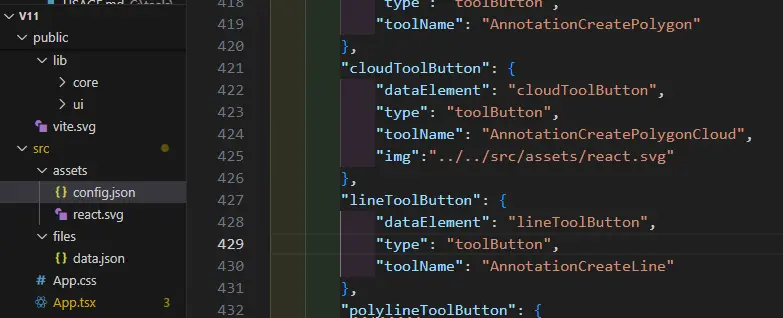
Figure 9- AN example of using an external image file showing how the path needs to be specified relative to the location where WebViewer code is running.
Save the changes and reload the page, and the icon will update.

Figure 10 - Specifying the icon as an external file will allow the image to be shown, but it won't change color to reflect that used by the tool.
If at this point the icon doesn’t update, then it is likely that the path that you specified is incorrect - DevTools within the browser will help you to debug that.
Even if the icon is there, it doesn’t reflect the color of the tool! What’s gone wrong?
In fact, nothing is wrong – that behavior is by design. SVG files can potentially contain JavaScript – which is a possible cyber-security risk. To remove that risk, icons specified using external SVG files won’t update their color.
If you want the color to update, then you must use inline SVG.
Adding a Second Instance of a Tool
We have already seen how we can update the UI for a particular tool, but what if you want two copies of the tool, each with a different color? There are good reasons why you might want to do so, but as a simple example let’s consider the script for a play, and the need to highlight the lines which are spoken by one character, and those spoken by another.
You could do this with one highlight tool, swapping the color repeatedly as you work through the script, but that would be tedious and error prone.
Another option is to have two highlight tool buttons – one for each actor, and so that we can tell them apart, each button can have a different image specified in the config file (I’m not showing the SVG as it is rather long). There is already one instance of the tool, so we can modify the existing one and add a second one.
Watch out when specifying the toolname for the second tool – it should end in a ‘2’, ‘3’ or ‘4’. As with all the other tools there is no version “1”. As such the second tool should be called, in this case, AnnotationCreateTextHighlight2.
Next add the name of the new button that to the collection of “GroupedItems” for the Annotation Tools. (The original button is already in the list, so it doesn’t need to be added again, even though the icon has changed).
Refresh WebViewer and now there are two buttons, each of which can be used to highlight specific lines in its own color.
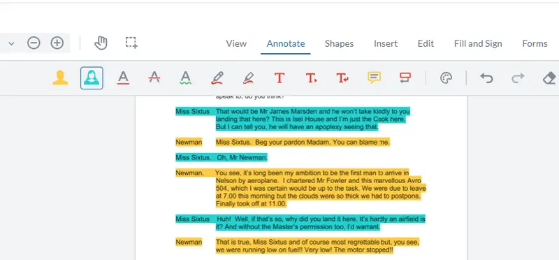
Figure 11 An example of using multiple tool buttons of the same type in order to solve a problem.
Adding Buttons Without Using a Config File
Using a config file allows the UI to be updated in an easy and consistent way. Nonetheless, it is also possible to add buttons programmatically, though it is a little clunky to do so.
As before, the first step is to define both of the buttons (and as before I’m not showing all of the SVG).
Next add the buttons to the “AnnotateToolsGroup” object.
There is no simple way to do this, but it can be done using some assumptions.
- We can get the AnnotateToolsGroup from the “tools-header”. Tools-header contains a collection of 11 individual tools (plus some other elements).
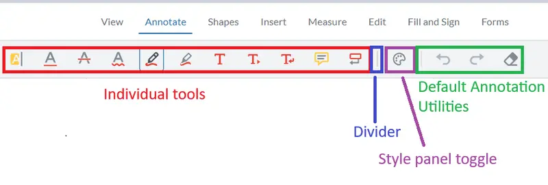
Figure 12 - The default Annotation Tools Group in WebViewer v11.
- Since the collection of individual tools is the first element in the Tool Group’s collection of items, we can get an object that represents just those tools.
- The Highlight tool is the first item in that collection, so we can replace that with our two new buttons.
As such we can use the following code:
When the web page refreshes, the new buttons will be present and the old highlight button will have been replaced, exactly as required.
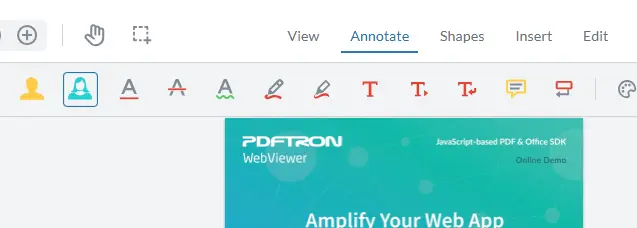
Figure 13 - The result of programmatically adding two highlight buttons, each with a different icon.
While that works, it should be considered fragile. If any of the assumptions prove false in future, then it will stop working. The use of a config file is considerably more resilient.
Summary
If you want icons that update to reflect the color of the tool that they represent, then the following are necessary:
1. The button must be a tool button
2. Only SVG based icons can be used
3. The SVG must be inline, not in an external file
4. The “fill” must not be specified for any parts of the SVG image that you want to reflect the tool color
Conclusion
We’ve seen how you can add custom buttons using the Modular UI, and how in some situations the color of the button images will update to reflect the style that the button uses.
WebViewer is much more than just a pretty face though.
With the ability to edit documents - both PDF and DOCX - apply redactions, and accurately measure things, along with a whole host of other features it offers a one-stop solution to many document processing workflows.
It’s easy to get started too. Grab yourself a free trial license and check out the documentation, videos and samples. You will be up to speed in no time, but if you do have any questions then please reach out to us on Discord.
