Roger Dunham
Published March 06, 2026
Updated May 18, 2026
6 min
Adding a Panel to a Flyout in WebViewer
Roger Dunham
Summary: In this article, we'll look at how to use the Apryse WebViewer Modular UI to add a flyout to a panel. This is a step-by-step guide covering customization, accessibility (WCAG 2.1 AA), and extending WebViewer's functionality.
Introduction
The Apryse WebViewer is an awesome tool. Offering the ability to view and edit PDFs, DOCX files, and Spreadsheets. It is also WCAG 2.1 AA compliant making it accessible, providing an inclusive user experience that meets regulatory requirements such as the European Accessibility Act.
Furthermore, the UI is both open source and extremely customizable. In this article, we will see how we can use the modular UI to add a panel to a flyout.
What Do We Mean by “Flyout”?
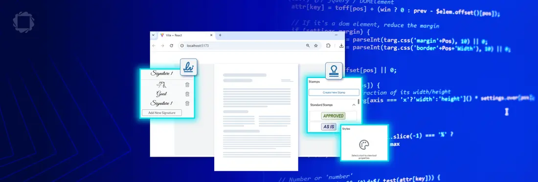
A flyout is essentially a hovering menu that appears when the user clicks on something, for example a button. It’s a great way of making functionality available without overcrowding the user interface by having it always visible. Typically, a flyout is only available briefly, allowing you to make a choice, and then it disappears again.
Until WebViewer 11.7, Flyouts were typically only used for Menus. Since then, some of them can also be added to panels.
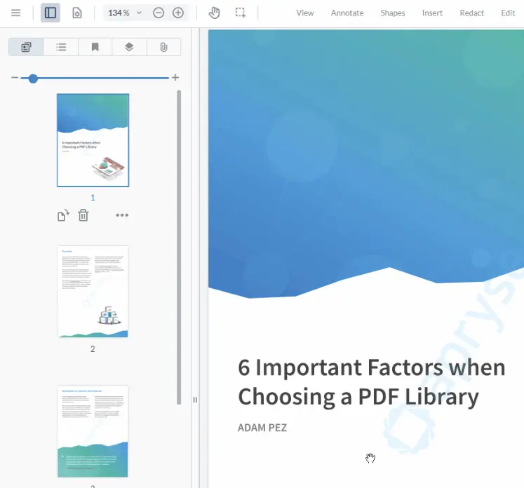
Figure 1: Flyouts shown in Apryse WebViewer.
What Do We Mean by “Panel”?
Within the WebViewer Modular UI, a panel is a modular, customizable container that organizes and displays content, such as thumbnails, bookmarks, or document outlines, on the left or right side of the viewer's interface.
Typically, panels stay visible while you work with the document, rather than just hovering until you do something else.
They can appear singly, such as with the Styles panel.
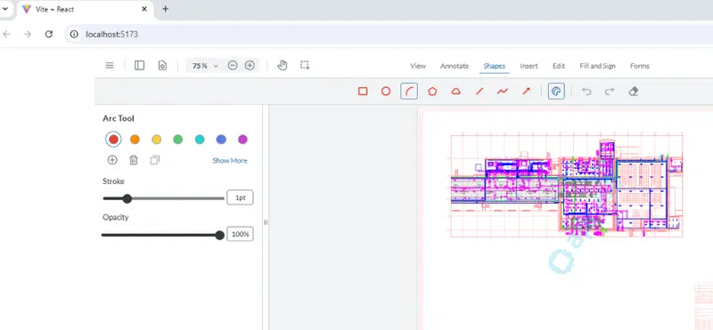
Figure 2: WebViewer showing the Style panel for the selected tool.
Or collected together into a tabbed panel.
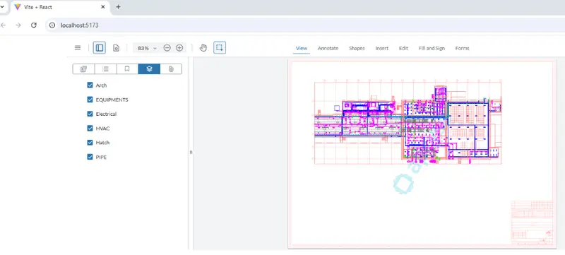
Figure 3: WebViewer showing the Layers panel (plus others) within a tabbed panel.
Panels offer a lot of functionality but generally can’t be shown within a Flyout. There are exceptions though.
Since WebViewer 11.8, it has been possible to show the following panels directly within a flyout.
- rubberStampPanel
- signatureListPanel
- stylePanel
That’s great. It means, for example, that you can show the Rubber Stamp panel only when it is needed, saving screen real-estate.
If you have a use-case that needs another type of panel available, then please contact us with your feature request.
In this article, we will see how we can add those panels into a flyout
Customizing the WebViewer UI
Being open source, you could fork the WebViewer UI code and make any changes that you want. That offers massive flexibility but could involve a lot of work.
In most cases, though, just being able to configure the UI will give you what you need.
The WebViewer Modular UI offers two ways to configure the UI; via the API or via a config file.
The legacy UI could only be configured via the UI. However, that is now deprecated, and it is strongly recommended to migrate to the Modular UI for better performance, features, and accessibility compliance.
You can try out the Customizable UI for WebViewer from our showcase page. In just a few steps, you can rapidly change the appearance of the UI.
How to Add a Panel to a Flyout Using the API
Let’s create a new flyout that contains the Rubber Stamp panel. The same mechanism can be used for a Signature or Style panel.
We’ll also add a button to WebViewer, that when clicked, causes the flyout to appear.
For this example, I’m using a React-based sample, such as one you can create using the WebViewer Get Started guide. The process is similar if you are using Angular, Vue, or even vanilla HTML.
I won’t include all of the code, so if you are not familiar with how to get started with WebViewer then I strongly recommend that you look at the Get Started Guide.
The WebViewer constructor returns a promise. When that resolves, it is possible to access the API using the instance object that is available within the “then” block.
The important parts are that:
- We create a flyout called ‘rubberStampFlyout’. This contains an item array in which we call render for a 'rubberStampPanel'. Alternatively, you can use the enum instance.UI.Panels.RUBBER_STAMP.
- We add that flyout to the array of flyouts for WebViewer.
- We create a toggle button which is used to show or hide the new flyout.
- We add the toggle button to a modular header. In this case, we are using the ‘default-top-header’ and keep the code simple by adding the button to the end of the list of items. In reality, you would probably want to place the button somewhere else, so feel free to modify the code to insert the button where you want it.
Great. Let’s save the code and serve the app.
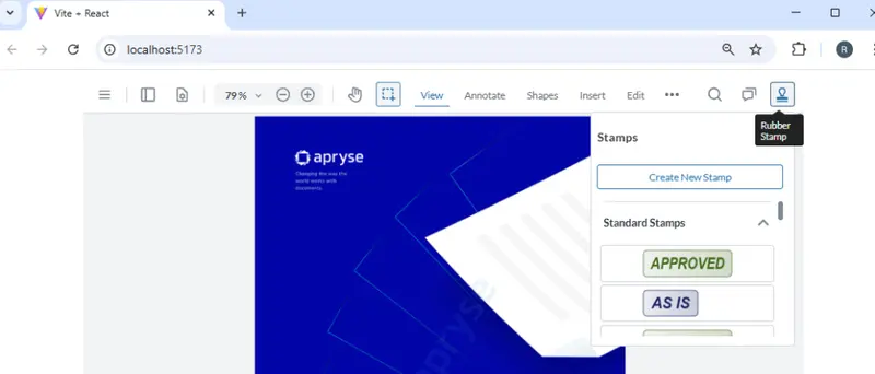
Figure 4: WebViewer showing our new button at the top right, which displays a flyout containing the Stamp panel when clicked.
The flyout will show until you click on another button, and it will then disappear, leaving you with an uncluttered UI.
There’s no need to add the new button to an existing header. You could create an entirely new header. Let’s do that and make it appear at the right hand side of WebViewer and use it to replace all of the other UI buttons, just because we can!
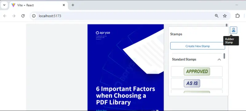
Figure 5: WebViewer showing a button in a custom, right-aligned, modular-header.
Working with the API can be a little confusing though, particularly if you make many differences. A simple alternative is to use JSON to define the UI. While you could declare the JSON “in-line” within the code, it can also be stored in a config file, which keeps the UI logic separate from the rest of the code.
Let’s create a new file called “config.json” in the src folder, and drop this code into it:
Now within the app.jsx file (or equivalent file if you aren’t using React and JavaScript) file, add an import.
import configUI from './config.json'And within the “then” block we can replace all of the code that we used previously with this one line.
instance.UI.importModularComponents(configUI);Note: This isn’t an exact match for what we have done before. While we can use a config file to do that, I wanted to just have the button in the center of the header, so I specified "justifyContent": "center” in the JSON.
I’ve removed all of the other UI elements, leaving just a single button, in order to keep the config file short. That way, you can see the important parts relating to creating a flyout, without being distracted by the rest of the UI.
Great. Let’s save that, and reload the project
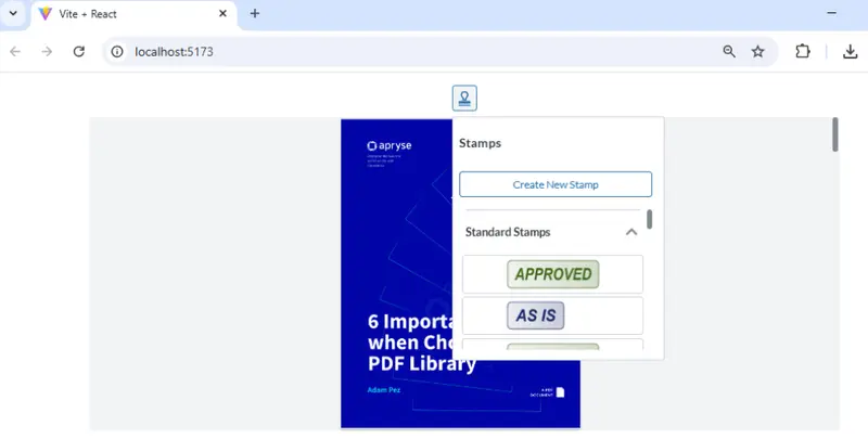
Figure 6: WebViewer showing a flyout containing the Rubber Stamp panel, specified in a JSON config file.
In reality, you would likely want to keep most of the default functionality and add our new button to it. Config files make that easy to do. There’s even a handy method instance.UI. exportModularComponents(); that allows the existing UI to be downloaded as a JSON file, so that you can use that as a template.
What About Style and Signature List Panels?
So far, we have only looked at Rubber Stamps. However, it is also possible to add Style and Signature List panels to a flyout.
You just need to create a new flyout that contains the render for these panels.
render: instance.UI.Panels.SIGNATURE_LIST // or “signatureListPanel”
or
render: instance.UI.Panels.STYLE // or “stylePanel”
Note that if you follow the initial code sample in this article, then the Style panel can be a little confusing, as it doesn’t show anything.
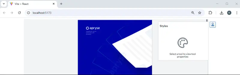
Figure 7: WebViewer showing the Style panel when nothing has been selected to set the style for.
That’s an artificial problem. The sample code only has one button (in order to keep it simple), so you can’t select a tool that you will set the style for (unless one has been cached).
In a more realistic situation, the Style panel works exactly as you might expect.
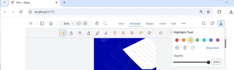
Figure 8: WebViewer showing the Style panel as a flyout when Highlight has been selected.
Similarly, if you are working with the signatureListPanel, you will probably want to specify fullAPI:true in the constructor, so that you have full access to the signature-based functionality. Again, that is something that works as expected in “real” code but can be confusing in over-simplified sample.
What Happens if You Try to Show a Different Type of Panel in a Flyout?
If you try to add an unsupported panel to a flyout, then a warning will be shown in the F12 DevTools, and the panel will not be displayed.
For example, if I try to display a layersPanel inside “myPanel” then I will get the following error:

Figure 9: If you try to render a panel that is not supported within flyouts, then a warning will be displayed within DevTools.
Where Next?
The Apryse WebViewer Modular UI provides an easy to modify UI, giving you control over the look and feel of WebViewer, whether you are working with PDFs, DOCX files, or Spreadsheets.
Furthermore, the default UI is WCAG 2.2 AA compliant, making it accessible to those with visual or other issues.
Awesome though the UI is, the real power of WebViewer is its ability to work with documents. You can check that out for yourself, right now, using the Apryse showcase. Not only can you customize the UI there, you can also view and edit files, add annotations, apply redactions and see a host of other functionality.
Once you have seen how powerful it is, get a free trial license, and try out the samples for yourself.


